Project Categories: Home Services & Construction

  • Anchorpoint Construction

    Anchorpoint Construction

    Website analysis

    The homepage presents commercial glazing, exterior cladding, curtain walls, window walls, canopies, and storefront systems. It describes work around Metro Vancouver and Vancouver Island. A selected-project area includes Wedge, Chapel, and Oakridge filters, followed by planning, fabrication, installation, and completion stages.

    Information and visitor journey

    Service categories give technical buyers a quick scope overview. The project gallery then supplies a visual route into the work, while the process stages explain coordination. Quote and project-viewing actions accommodate visitors at different levels of readiness.

    Design rationale

    Project pages could connect each photographed building with verified scope, materials, and installation responsibilities. The review should also check navigation destinations: the captured footer includes a separate staging-domain home link.

    Presentation and audience

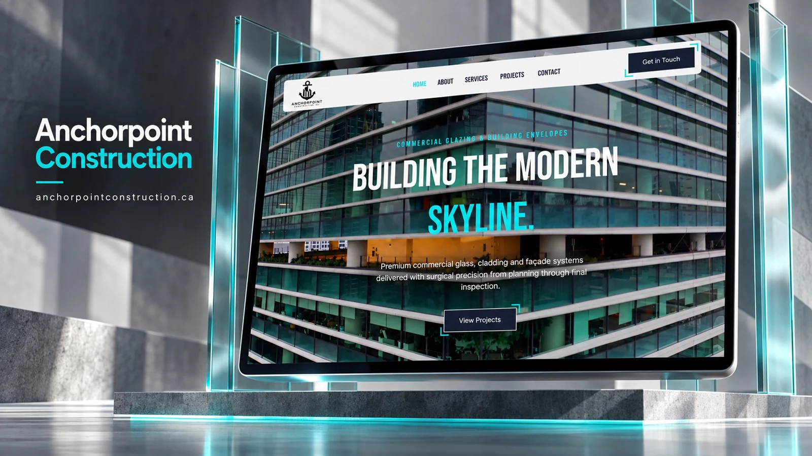
    The refreshed screenshot uses glass towers as a full-screen backdrop, white condensed display lettering, and a turquoise accent for the final headline word. A light rounded navigation bar floats above the image, while dark action buttons use turquoise corner details. The architectural photograph immediately establishes the scale and material context of the work without depending on a long introductory paragraph.

    The visual emphasis on skyline and façade systems aligns with a business audience evaluating specialist capability. The View Projects action is therefore a logical first step: a project portfolio can demonstrate the kinds of buildings and assemblies discussed in the service copy. For a complete project record, each gallery item would ideally specify verified responsibilities and system types, allowing the imagery to support a precise account rather than an implied claim to every aspect of the building.

    Website analysis based on the observed page or supplied reference; no client brief, authorship, or measured outcomes are asserted.
  • Five Lakes Roofing

    Five Lakes Roofing

    Website analysis

    The captured page exposes a service selector with roof inspection, repair, replacement, shingle roofing, storm damage, emergency roofing, insurance claim assistance, and a free estimate. A refreshed browser capture also establishes the West Michigan focus and the complete estimate panel.

    Information and visitor journey

    A service-based entry point can help homeowners describe their situation before a conversation. Urgent repair and planned replacement have different information needs, making the choice of service more useful than a single undifferentiated contact button.

    Design rationale

    Present inspection, repair, replacement, and urgent assistance as understandable groups. Supporting copy should explain what information a homeowner can prepare, while any response-time promise, license, or guarantee should be checked against business documentation.

    Presentation and audience

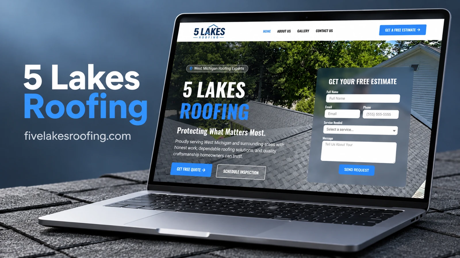
    The refreshed visual capture shows a blue-and-white identity, a roof photograph spanning the hero, condensed uppercase headings, and a translucent estimate panel on the right. The left column introduces West Michigan coverage and includes separate quote and inspection buttons. This makes the page function as both an introduction and an intake screen: a visitor with a defined need can begin immediately, while another can read the promise first.

    The estimate panel contains name, email, phone, service choice, and message fields. Its placement beside the roofing image keeps the requested information in the same view as the business context. Blue appears in the logo, headline emphasis, and actions, creating a recognizable path through the otherwise photographic composition. The header offers About Us, Gallery, and Contact Us for visitors who want additional context before sending a request.

    Website analysis based on the observed page or supplied reference; no client brief, authorship, or measured outcomes are asserted.

  • Danger Designs

    Danger Designs

    Website analysis

    The captured homepage introduces kitchen design and cabinet solutions for investors and homeowners. Its navigation connects About, Cabinets, Portfolio, Process, and Contact sections. A gallery separates all projects, cabinets, and kitchens. The page describes consultation, design planning, cabinet selection, and project handoff.

    Information and visitor journey

    The combination of portfolio browsing and process explanation addresses two different questions: whether the aesthetic fits and how a project would proceed. Get in Touch and View Our Work provide distinct next steps. The inquiry form collects names, email, phone, and project details.

    Design rationale

    Use the cabinet and kitchen categories as the main comparison structure. Individual project descriptions could explain materials, spatial constraints, and the decisions visible in each photograph without attributing unverified commercial outcomes.

    Presentation and audience

    The key audience distinction is between someone choosing a kitchen for personal use and an investor coordinating a property improvement. Both can use the same gallery, but their practical questions may differ: finish preferences, budget boundaries, timing, and contractor coordination. The project-details field is therefore a useful open space rather than forcing every inquiry into a rigid package. A process explanation also gives the gallery a practical counterpart: the visitor can see an attractive room and then understand the steps between inspiration and handoff.

    The cabinet and kitchen tabs provide a modest amount of filtering without turning the page into a complex catalogue. Keeping the contact action available after browsing reduces the need to return to the beginning. For portfolio documentation, the strongest material would pair a selected image with a short explanation of the visible layout decision and an accurate description of what the design service includes.

    Website analysis based on the observed page or supplied reference; no client brief, authorship, or measured outcomes are asserted.

  • 1General Contractor LLC

    1General Contractor LLC

    Website analysis

    1General Contractor presents roofing, remodeling, water restoration, and gutter services. The captured homepage uses a white header with a black-and-red identity, a visible telephone number, and a prominent quote button. Below it, a darkened construction photograph supports a large white headline with red emphasis. A separate roofer image makes the trade immediately recognizable. The two primary actions are Get Free Quote and Schedule Inspection.

    Design rationale

    The homepage gives quotation and inspection different roles, which is useful when a visitor may not yet know the scope of a roof or restoration problem. Navigation stays concise with Home, About, Services, and Contact. A logical next layer would explain which details are needed for each request and how an inspection differs from an estimate. The capture does not establish licensing, response times, or project outcomes.

    A visual hierarchy built around the trade

    Red is used selectively for the identity, the emphasized headline phrase, and the primary quotation action. That repetition ties the visual system together and makes the strongest action easy to locate. The background shows construction at a larger scale, while the inset roofer photograph brings attention back to an individual trade activity. The contrast between the two images helps communicate both site context and practical work. The bold condensed heading suits a direct service presentation, though mobile layouts would need to preserve readable line lengths and keep the action buttons reachable.

    Matching the request to the situation

    Roofing, remodeling, restoration, and gutters can involve different levels of urgency and preparation. Service-specific information would help a visitor determine which route matches the issue without expecting them to diagnose a problem. The inspection action can be useful for uncertain scope, while a quote request can invite a short project description. The visible phone number creates an alternative to the form journey. A complete functional review should confirm that these routes reach the intended destinations and clearly explain whether a request is pending or confirmed. The portfolio analysis records the homepage’s presentation and pathways without asserting that any construction project was delivered by the reviewer.

    The quote button in the header remains visually separate from the inspection action below. That distinction should be preserved in smaller layouts so both routes retain their meaning.