Project Categories: Home Services & Construction

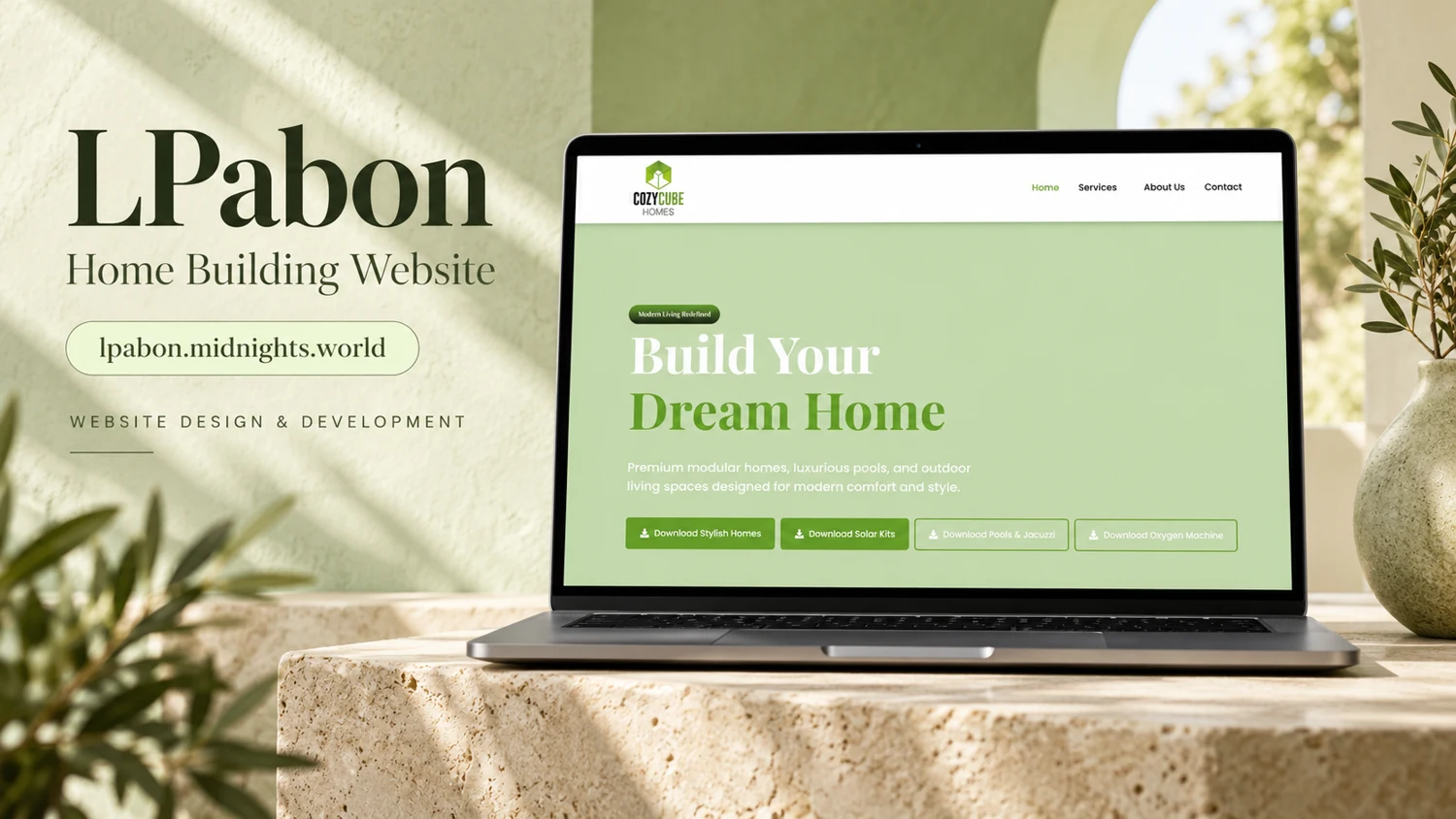
  • LPabon

    LPabon

    Website analysis and design rationale

    A supplied home-building reference presents a simple introductory page with a light green residential identity.

    Audience and purpose

    A prospective homebuilding customer will need to distinguish an inspiring image from an actual offer. The broad dream-home message is suitable for an introduction, but the next stage should explain what can be discussed or selected. The reference is therefore most informative as a study of first-screen tone, not as a complete specification of the business.

    Observed presentation

    The provided cover names LPabon and identifies a home-building website. Its displayed page uses a pale navigation bar, a light green hero, and a large dream-home headline with a compact group of controls beneath. The public URL could not be retrieved, so this review cannot confirm whether it represents a current production site.

    Visual direction

    Soft green, white, plants, and bright interior lighting create a calm domestic atmosphere. The visible site favors broad whitespace and a clear headline over dense content. This approach can provide an inviting introduction, though the reference image alone supplies little evidence about the full page structure or project catalogue.

    Design rationale

    Further documentation should establish the actual building offer, service area, available plans, and enquiry process. Project examples could explain size, configuration, and confirmed specifications. These are possible information needs for a home-building audience, not verified features, and the reference does not support claims about cost, construction quality, or delivered homes.

    Reference-based analysis: the live page was not fully accessible, so current content and interactions remain unverified.
  • Cozy Cube Homes

    Cozy Cube Homes

    Website analysis and design rationale

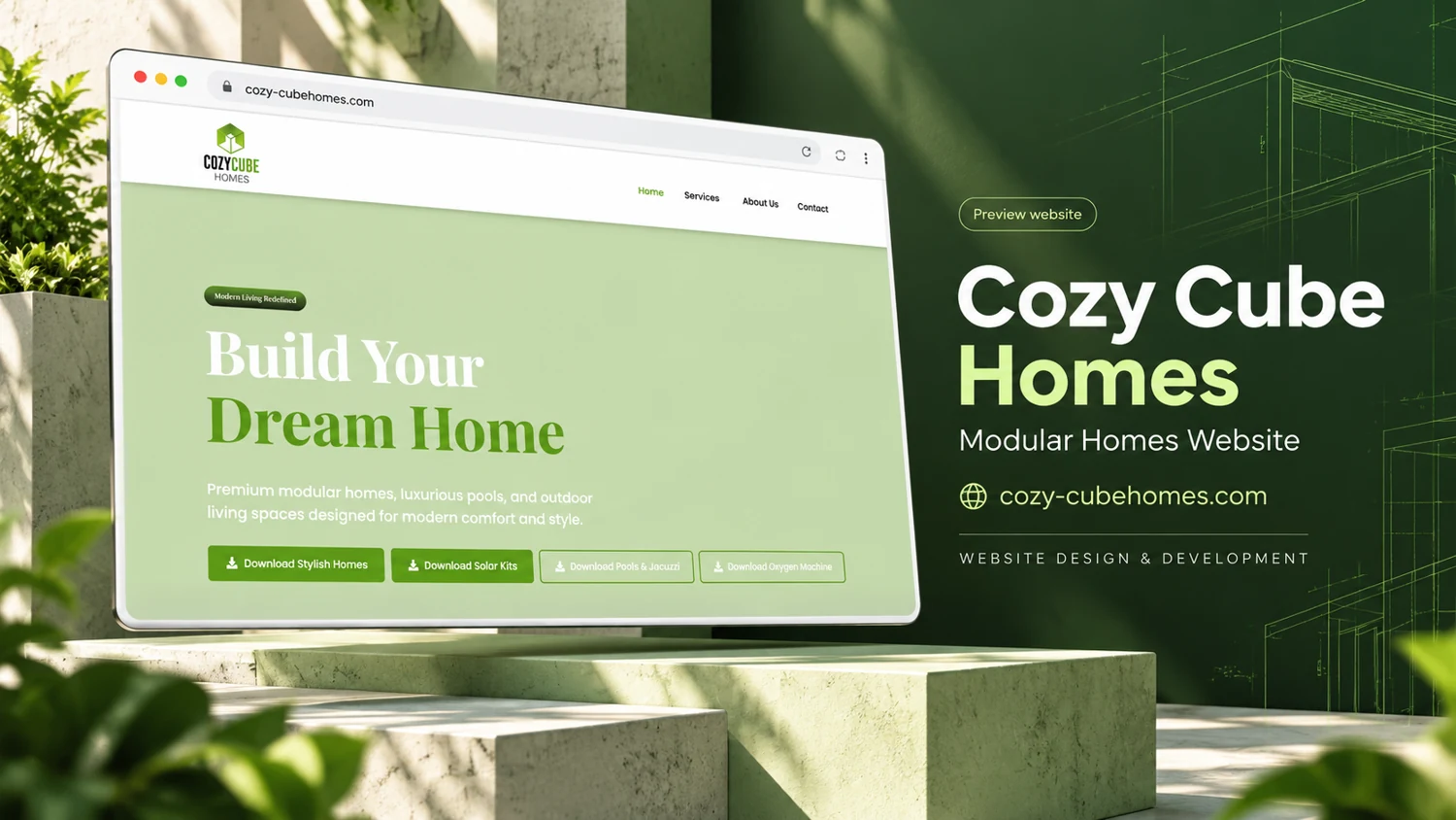
    A supplied modular-home reference introduces the brand with a light green page and a clear residential headline.

    Audience and purpose

    Someone exploring modular housing will likely compare configurations and practical constraints before making contact. The simple introductory screen can reduce visual complexity at the start, but supporting pages need enough concrete detail for meaningful comparison. The design rationale is to move from an approachable brand message into verified product information without implying that every home is interchangeable.

    Observed presentation

    The cover identifies Cozy Cube Homes as a modular-homes website. The screen contains a white header, a green introductory area, and a prominent home-building message above a row of controls. Public retrieval failed, so current home models, specifications, purchase steps, and contact destinations remain unverified.

    Visual direction

    The supplied composition uses green architectural outlines, a pale interior setting, and a clean laptop presentation. The website visible on the screen gives the headline generous space, creating an uncomplicated first impression. Its palette aligns the residential message with a calm, approachable visual identity rather than a heavily technical product display.

    Design rationale

    For a modular-home website, a useful next content layer would establish actual models, dimensions, inclusions, site requirements, and the enquiry process. Any price or delivery statements need clear conditions. These are proposed review priorities, not assertions about the business, and no sales results, approvals, or completed builds can be inferred from the reference.

    Reference-based analysis: the live page was not fully accessible, so current content and interactions remain unverified.
  • MarWin Construction

    MarWin Construction

    Website analysis and design rationale

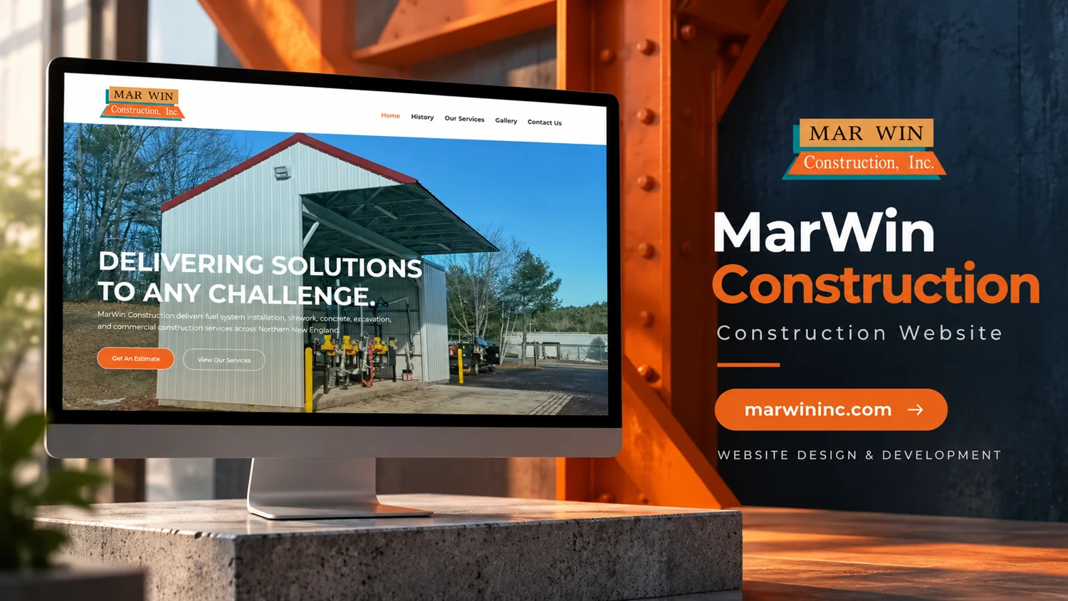
    A supplied construction website reference emphasizes a broad capability statement and project-related imagery.

    Audience and purpose

    A prospective construction customer needs to know which challenges the company actually takes on. The broad headline creates room for many possibilities, so specific examples are especially important in the next section. A capability-led introduction becomes useful when a visitor can connect the message to a recognizable building or project requirement.

    Observed presentation

    The cover names MarWin Construction and displays a website headline about addressing project challenges. A pale navigation bar sits above a substantial building photograph, with orange accent elements. Live browser access was blocked by an automatic review failure, so this entry relies on the supplied visual reference rather than a current site inspection.

    Visual direction

    Steel-like framing, orange structural elements, and dark blue tones create an industrial presentation around the laptop. The website visible within the cover uses a straightforward image-and-headline arrangement. The composition suggests a capability-led introduction, but the image alone does not establish particular trades, project types, or geographic coverage.

    Design rationale

    The next evidence needed is a readable service page and an approved project list. A construction portfolio can make scope clearer through captions, project categories, and concise enquiry prompts. This analysis does not infer company credentials, project outcomes, or the author’s involvement from the promotional cover. Those details require separate confirmation.

    Reference-based analysis: the live page was not fully accessible, so current content and interactions remain unverified.
  • Home’s Optimal Solutions

    Home’s Optimal Solutions

    Website analysis and design rationale

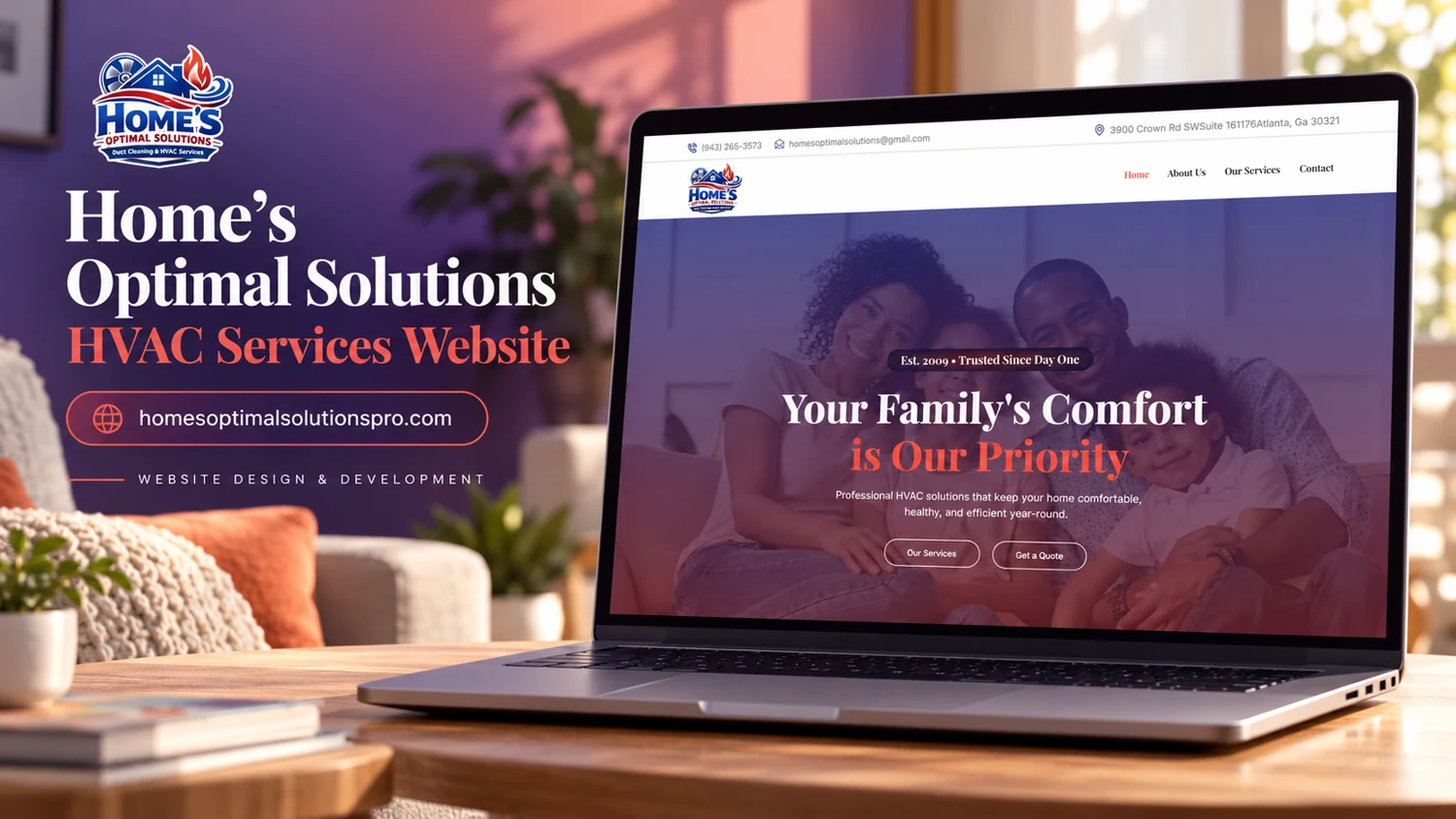
    A supplied HVAC website reference introduces the business through household comfort and a warm residential image.

    Audience and purpose

    A household seeking help with comfort may arrive with an urgent fault or with a planned upgrade. A reassuring family image can establish tone, but the following content should help those visitors choose the correct route. Distinguishing routine enquiries from any verified urgent-service procedure would make the introductory message more actionable.

    Observed presentation

    The reference cover identifies Home’s Optimal Solutions as an HVAC-services website. Its laptop screen shows a family-oriented hero message and a compact header, with purple and coral accents. The attempted live navigation timed out, leaving current service details, location, availability, and contact destinations unverified.

    Visual direction

    The cover’s living-room setting, evening light, and saturated purple palette connect the service category with domestic comfort. The displayed website uses a large central message over photography. This design direction can make a technical service approachable, provided that practical service information follows promptly.

    Design rationale

    A useful content hierarchy would distinguish installation, maintenance, repair, and any confirmed emergency arrangements. Visitors should be able to find the service area and preferred enquiry method without guessing. These suggestions are based on the reference category only; this entry makes no claim about certifications, response times, prices, or completed HVAC work.

    Reference-based analysis: the live page was not fully accessible, so current content and interactions remain unverified.
  • Bee Fixed Handyman Services

    Bee Fixed Handyman Services

    Website analysis and design rationale

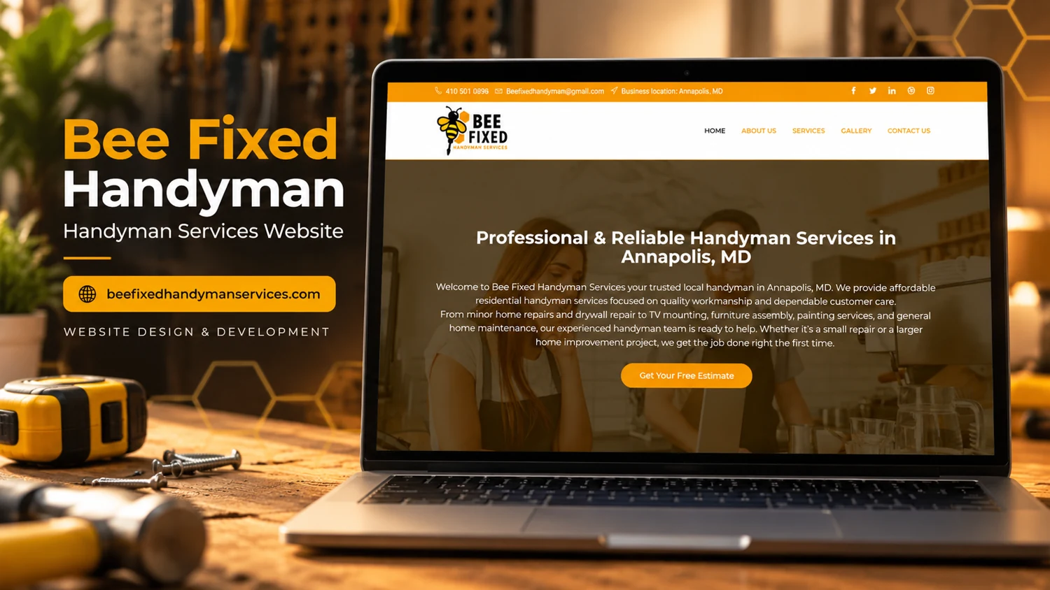
    A local handyman website foregrounds the service area, common repair tasks, and an estimate request.

    Audience and purpose

    A homeowner with a small repair usually starts with a task rather than a broad service category. The detailed FAQ can accommodate that behavior by naming recognizable jobs. The estimate route becomes more useful when the visitor can connect a specific need to a service description before sending an enquiry.

    Observed presentation

    The reviewed page identifies Annapolis, Maryland, and describes residential repairs, drywall work, television mounting, furniture assembly, painting, and maintenance. Navigation includes Services, Gallery, and Contact Us. A prominent estimate action is followed by image links and a detailed service FAQ. The captured testimonial area contains placeholder text.

    Visual direction

    The reference uses strong yellow accents, tools, and a darkened residential hero. The visual association is immediately practical. The site’s combination of a broad introductory statement and detailed FAQ can help visitors determine whether a particular small job is within scope before contacting the business.

    Design rationale

    The placeholder testimonials should be replaced with approved evidence or removed. A concise service grouping could make the long list easier to scan, while an estimate form could request location, task description, and photographs. This review does not confirm prices, insurance, availability, or workmanship; it examines how the existing information supports a homeowner’s first enquiry.

    Analysis based on the captured public homepage and supplied reference; authorship and business results were not established.

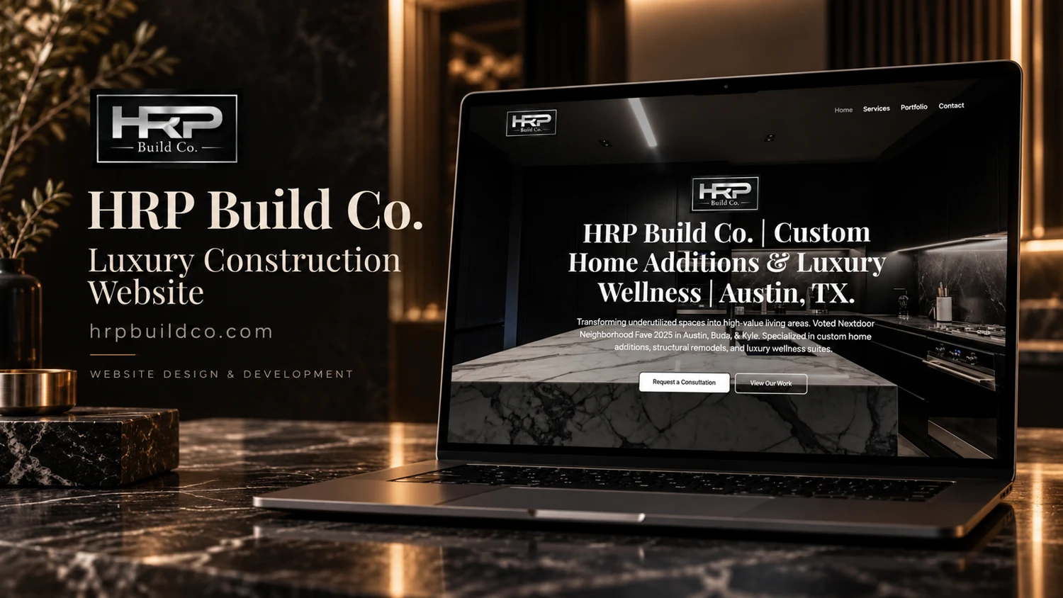
  • HRP Build Co.

    HRP Build Co.

    Website analysis and design rationale

    A construction-company homepage pairs specialized home-improvement positioning with consultation and portfolio routes.

    Audience and purpose

    A homeowner considering a significant addition will often need reassurance about relevant experience before initiating a conversation. Placing the portfolio action beside consultation gives that visitor a reasonable intermediate step. A useful project account would explain the type of space and the nature of the work without relying on luxury language alone.

    Observed presentation

    The observed page identifies custom home additions, structural remodeling, and luxury wellness spaces in the Austin area. Main navigation contains Home, Services, Portfolio, and Contact. The hero provides separate actions for requesting a consultation and viewing work. An image carousel appears farther down the captured page.

    Visual direction

    The supplied cover frames the site in dark stone, bronze lighting, and construction-related imagery. Inside the laptop, a high-contrast headline sits against a dark photographic background. This creates a premium visual direction, while the two hero actions acknowledge visitors who are ready to enquire and those who first need project evidence.

    Design rationale

    Project pages could substantiate the service positioning through clearly captioned images, project scope, and location where approved. Consultation content should help homeowners explain their property and intended changes. Awards and experience statements belong to the site’s own marketing copy and were not independently validated as part of this design review.

    Analysis based on the captured public homepage and supplied reference; authorship and business results were not established.

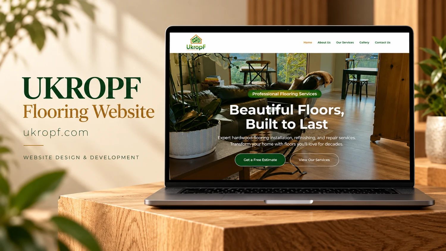
  • UKROPF

    UKROPF

    Website analysis and design rationale

    A supplied flooring website reference emphasizes finished interiors and a straightforward consultation path.

    Audience and purpose

    For someone choosing flooring, the room image provides an emotional starting point: it shows a surface as part of a lived-in interior. The next decision is more practical, involving the material, appearance, and intended room. A strong continuation would bridge those two modes through comparable examples instead of asking photography alone to explain the offer.

    Observed presentation

    The supplied cover explicitly identifies UKROPF as a flooring website. Within the laptop display, a furnished interior supports a headline about beautiful, durable floors, followed by a compact green call to action. The live URL could not be retrieved during this review, so service details and working destinations remain unverified.

    Visual direction

    Warm timber, natural light, and green brand elements connect the composition to residential interiors. The website visible inside the cover uses a pale header above a large room photograph. This arrangement gives material texture and the appearance of a completed space more emphasis than a dense list of product specifications.

    Design rationale

    A useful next review would establish which flooring categories, service areas, and installation options are actually offered. Product photography could be paired with concise material descriptions, and consultation forms could ask about room type and project scope. These are proposed information needs, not confirmed features or a reconstruction of a client brief.

    Reference-based analysis: the live page was not fully accessible, so current content and interactions remain unverified.
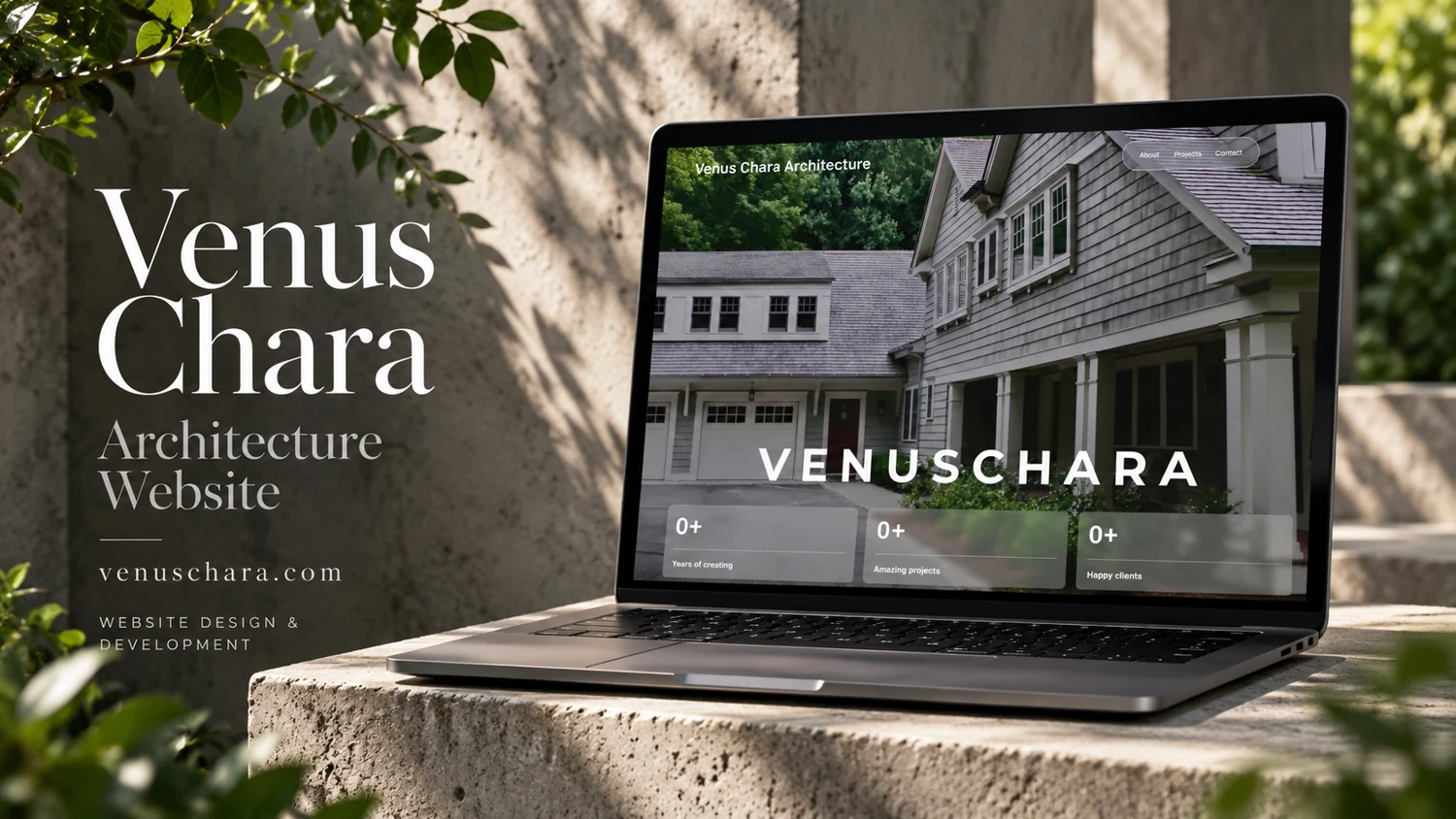
  • Venus Chara

    Venus Chara

    Website analysis and design rationale

    A residential architecture portfolio places the architect’s identity, selected projects, and direct enquiry in a compact sequence.

    Audience and purpose

    Homeowners evaluating an architect need to understand both aesthetic approach and the handling of real properties. The named projects and before-condition labels provide useful anchors for that decision. A consistent presentation of existing conditions, design intent, and finished spaces would turn image browsing into a more informative account of the practice’s approach.

    Observed presentation

    The reviewed page includes About, Projects, and Contact navigation. Its biography describes residential architecture in New York City and surrounding communities. Project headings identify work in Redding, Connecticut, and Buffalo, New York, with before-condition labels. A contact form includes name, email, website, and message fields.

    Visual direction

    The reference image uses a quiet natural setting around a laptop displaying residential architecture. Large serif lettering in the cover complements the home imagery. The observed page structure allows the biography and project presentation to support one another, giving visitors both an individual practice identity and examples to inspect.

    Design rationale

    Project detail pages could clarify the relationship between existing conditions and finished spaces, including consistent captions and descriptive image text. Animated statistics were captured at zero, so their final values are not reliable evidence. The portfolio should communicate its substance through documented projects rather than dependent counter animations.

    Analysis based on the captured public homepage and supplied reference; authorship and business results were not established.

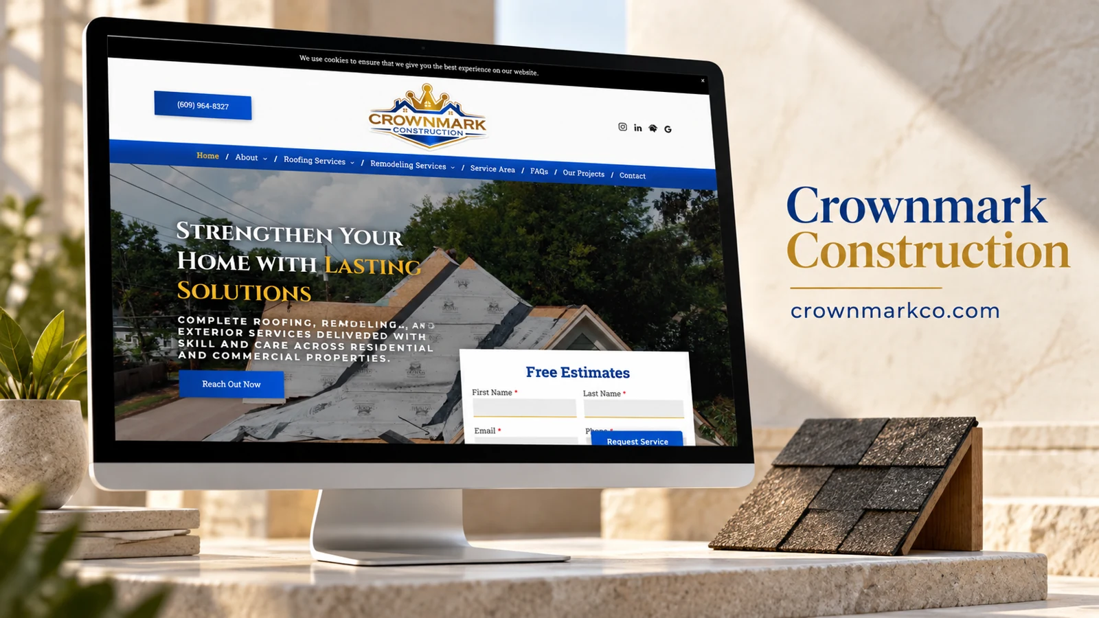
  • CrownMark Construction

    CrownMark Construction

    Website analysis

    The captured site covers residential and commercial roofing, gutters, siding, emergency tarping, and kitchen and bathroom remodeling. Service-area, FAQ, review, resource, and project links support the main navigation. A visible estimate form requests contact details and a message.

    Information and visitor journey

    The broad service menu allows different property needs to enter through relevant pages. It also creates a navigation challenge: related roofing options must remain understandable on small screens. The project and resource sections offer complementary routes for visual evaluation and further reading.

    Design rationale

    Service pages should define the work clearly and connect to relevant project examples. Any licensing, insurance, family-ownership, or pricing statement should remain a business claim unless independently verified; this analysis does not certify those credentials.

    Presentation and audience

    The site’s information structure reflects a broad home-improvement offer. Roofing materials, commercial flat roofs, gutters, siding, storm-related work, and interior remodeling appear as distinct destinations. This helps users enter through a specific need, but also makes grouping important: a homeowner should be able to distinguish a material choice from a service type. The FAQ and resources sections can address that terminology without overloading the top-level menu.

    The estimate form appears alongside the business introduction, reducing the distance between understanding the offer and asking about a project. The prominent telephone route supports visitors who prefer a conversation. Project imagery is valuable here when it is connected to the corresponding service, because the same business covers exterior and interior work. A portfolio account should therefore describe the navigation and inquiry structure precisely rather than reducing the whole site to a generic contractor landing page.

    Website analysis based on the observed page or supplied reference; no client brief, authorship, or measured outcomes are asserted.

  • RPC Pro Construction Inc

    RPC Pro Construction Inc

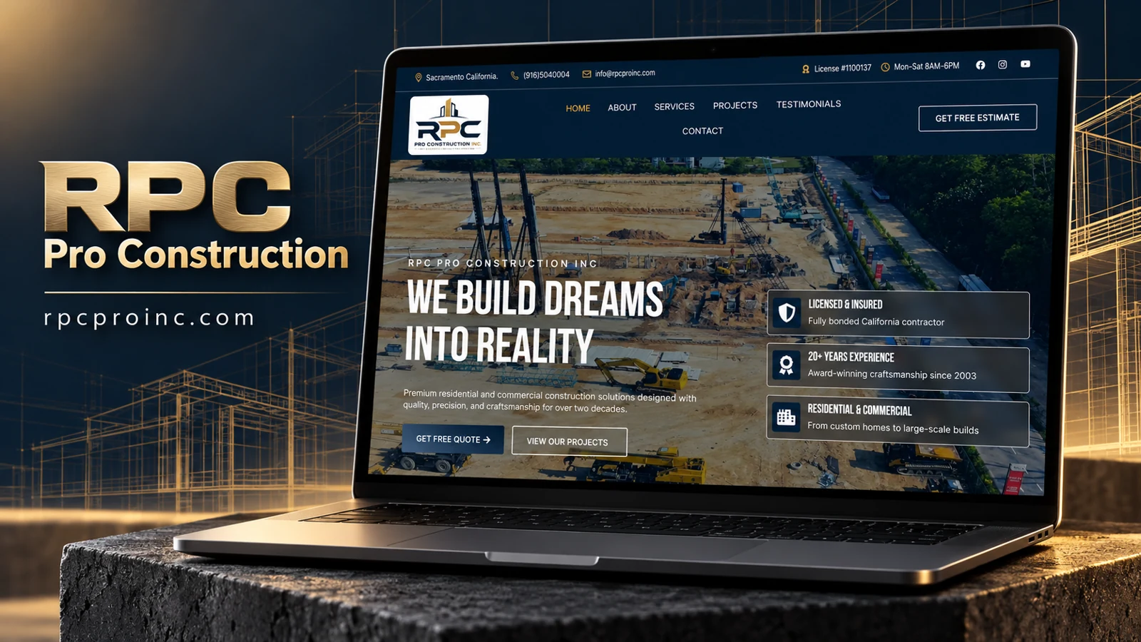
    Website analysis

    The rendered homepage identifies RPC Pro Construction Inc and displays Sacramento, California, contact information. The navigation includes About, Services, Projects, Testimonials, and Contact, with a separate free-estimate action. The hero introduces residential and commercial construction and pairs a quote route with View Our Projects. This browser evidence replaces the earlier research-tool timeout.

    Visual identity

    A dark navy header contains the RPC logo, contact information, hours, and a license-number statement. Gold accents appear in the utility row and active navigation. Below, an aerial construction-site photograph fills the hero, with a dark overlay supporting large condensed white lettering. The imagery emphasizes the scale and activity of construction rather than presenting only finished interiors or a single house.

    Content hierarchy

    The left side carries the introductory message and two actions. The right side groups three credibility themes into bordered translucent panels: licensing and insurance, experience, and residential-commercial scope. This arrangement lets a reader scan the proposed reasons to consider the company without interrupting the main introduction. These remain statements made by the website; the review does not independently verify the license, insurance, experience, or award references.

    Visitor journey

    A prospective customer can request an estimate directly or first examine projects. These are distinct stages of evaluation, making the paired actions more useful than duplicate contact links. The service and project destinations should connect clearly: a visitor exploring a particular construction need benefits from seeing relevant examples and an accurate account of the company’s responsibility in each. Testimonials provide a further route, but they should be supported by attributable source information.

    Design rationale

    The dark header and image overlay create continuity across the first screen, while white text keeps the reading hierarchy prominent. The portfolio emphasis is especially appropriate for a visually evaluated service. A useful next review would check whether project pages retain that clarity and whether the estimate destination explains the information needed to begin a conversation. This analysis asserts no development authorship or measured commercial result.