Project Categories: Cleaning & Restoration

  • LuxMasters Exteriors

    LuxMasters Exteriors

    Website analysis and design rationale

    A supplied exterior-cleaning reference combines a vivid service identity with a prominent enquiry action.

    Audience and purpose

    Residential and business customers may evaluate exterior cleaning through different property concerns. The reference headline includes both audiences, while the house photograph emphasizes one of them visually. Clearly organized examples could preserve the strong residential first impression while making any confirmed commercial services equally understandable.

    Observed presentation

    The cover identifies LuxMasters as an exterior-cleaning website. The screen headline references exterior cleaning for homes and businesses, with a house photograph beside the copy. A bright green button stands out in a dark blue header. The live domain could not be retrieved, so detailed services and form behavior remain unverified.

    Visual direction

    Electric green and deep blue create a distinctive contrast, while an evening residential photograph gives the service category an immediate visual context. The supplied composition emphasizes the laptop display and repeats the brand colors around it. The site itself appears to separate introductory copy from the main property image.

    Design rationale

    A more complete assessment would verify cleaning categories, geographic coverage, and how quotations are requested. Before-and-after images need matching context and honest captions to avoid overstating results. These are proposed review criteria; the reference does not prove service quality, customer satisfaction, insurance status, or any measurable commercial effect of the design.

    Reference-based analysis: the live page was not fully accessible, so current content and interactions remain unverified.
  • 561Mold

    561Mold

    Website analysis

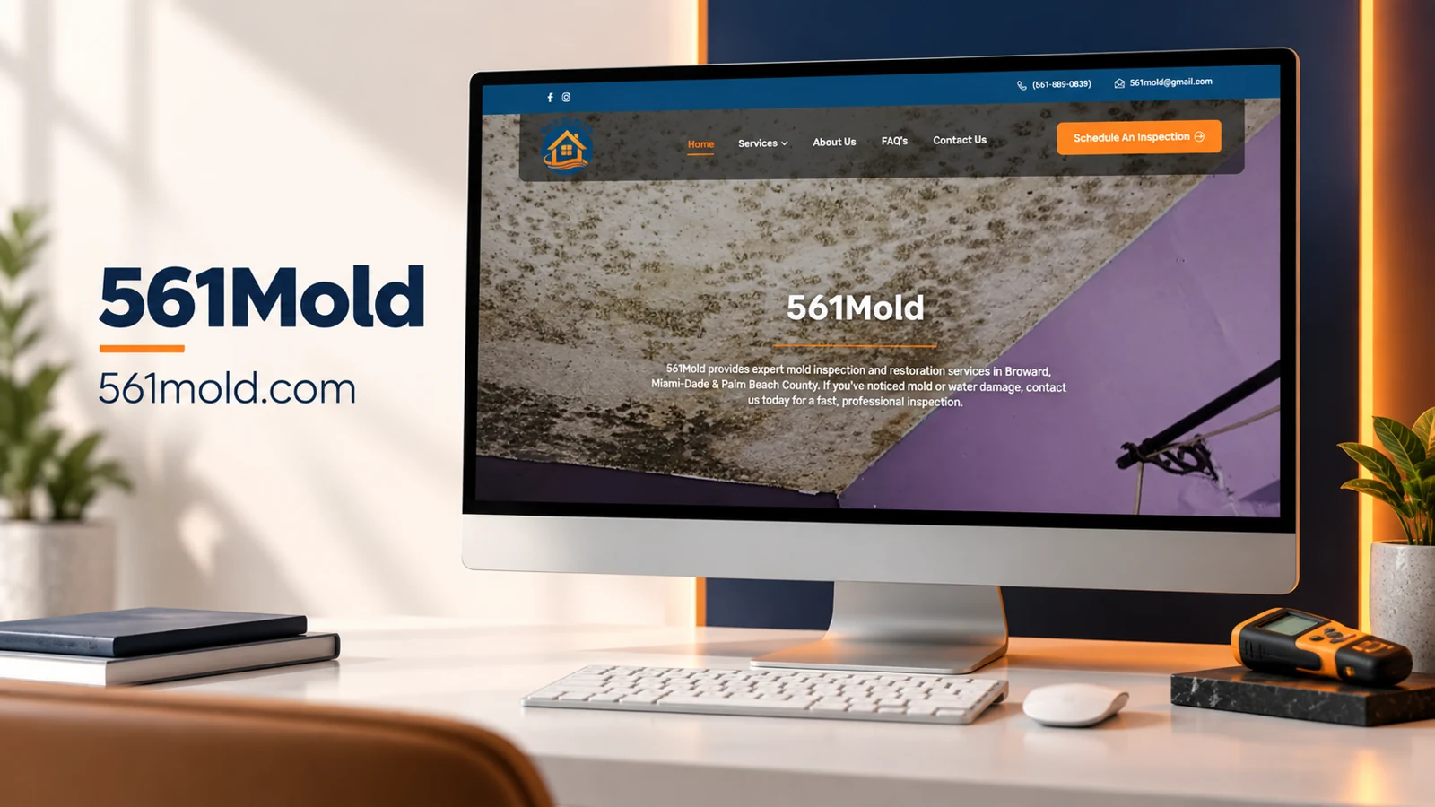
    The fully rendered browser capture identifies 561Mold as a mold inspection and restoration service covering Broward, Miami-Dade, and Palm Beach County. The homepage provides phone and email contact information, a service menu, About Us, FAQs, and Contact Us. A prominent Schedule An Inspection button gives the introduction a clear next step. This later browser evidence replaces the earlier unavailable-source draft.

    Visual direction

    The hero uses a close-up photograph of a visibly affected ceiling. A blue contact strip and orange accent color establish the identity around that practical image. The navigation sits in a translucent dark band, and the centered white headline remains separate from the short service-area explanation beneath it. The imagery immediately establishes the kind of concern the service addresses, while the geographic copy helps visitors decide whether the business is relevant to their property.

    Inquiry journey

    The scheduling action appears in the header, so a visitor who already knows what they need can proceed without reading a long introduction. Phone and email offer alternatives for people who want clarification first. The service menu and FAQ route are useful for visitors who are still distinguishing inspection from restoration. Those pages should explain the actual service scope and what happens after an initial inquiry rather than relying on the hero photograph to answer technical questions.

    Design rationale

    Blue provides a stable frame around the page, while orange marks the most important action and the small divider beneath the brand name. This is a focused local-service layout: identify the concern, confirm the area, and request an inspection. A fuller case study could compare how individual service pages explain their scope and how the contact destination preserves that context. The screenshot does not verify health claims, professional credentials, inspection methods, or remediation outcomes.

    Scope

    This is a website analysis of the observed interface, not a claim of design authorship or a reconstructed client project history.

  • Aura Clean & Comfort

    Aura Clean & Comfort

    Website analysis

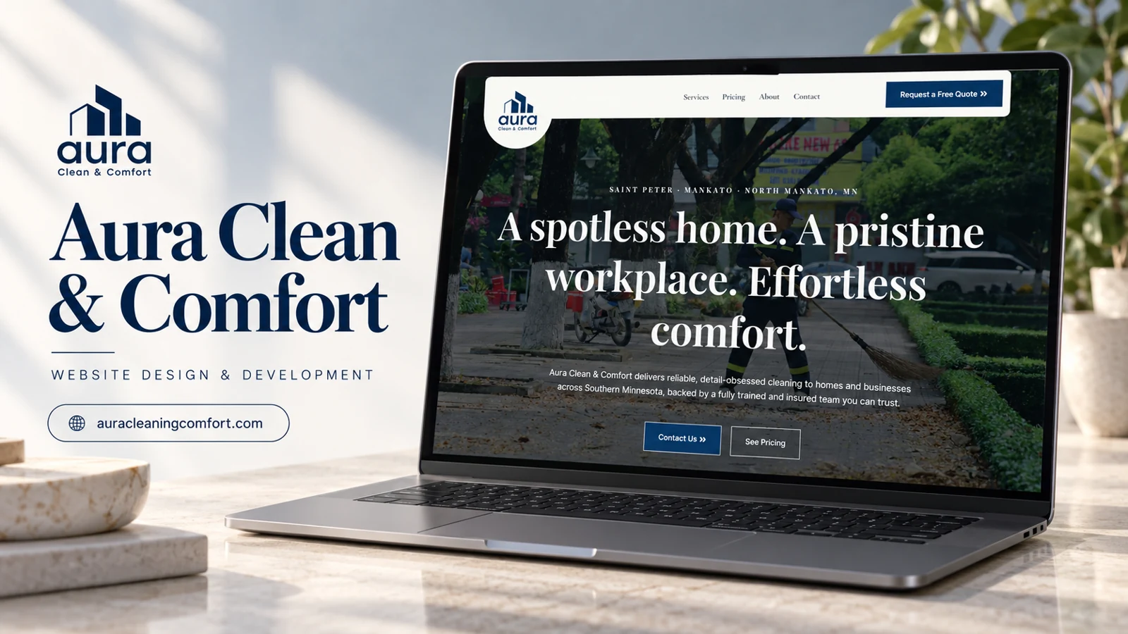
    Aura Clean & Comfort identifies Saint Peter, Mankato, and North Mankato in Minnesota as its service area. Its homepage distinguishes residential hourly cleaning from commercial service tiers. Bronze, Silver, and Gold packages organize increasingly detailed workplace tasks, while residential content emphasizes recurring schedules. Quote actions lead toward an on-page contact section that asks about the space and cleaning needs.

    Design rationale

    The practical strength is the separation of household and workplace decisions. Prospective customers can compare service scope before making contact. The captured form repeats Residential in its service selector, so a content review should confirm that commercial inquiries have a correctly labeled option. The phone link also warrants verification because its recorded destination was empty.

    Service comparison as a decision tool

    The commercial tiers translate cleaning into concrete scope. Bronze introduces regular surface, restroom, waste, and floor tasks; Silver adds items such as glass and kitchen detailing; Gold includes deeper floor and carpet work. That ladder is useful because a business customer can identify differences before requesting a price. The residential offer follows a different logic, emphasizing frequency and an initial assessment. Keeping these models distinct avoids suggesting that household cleaning follows the same package assumptions as a workplace contract. The service-area line answers geographic fit before the visitor reads the package details.

    Turning interest into a useful request

    The inquiry prompt asks about space, square footage, frequency, and other requirements. Those details are directly related to estimating cleaning work, so the form can prepare a more productive follow-up conversation. The page also mentions scheduling flexibility, checklists, and consistent staff as reasons to consider the provider. Such statements should be kept current and attributable to the business. A content refinement would make after-hours commercial needs easy to specify, while residential visitors could identify a preferred recurrence. This analysis does not establish that the form was submitted or that a quote was received.

    The assessment language is particularly useful where a fixed online price would be misleading. It gives residential visitors a starting point while allowing the provider to account for the actual space and requested frequency before confirming the scope.

  • SpeckNoMore

    SpeckNoMore

    Website analysis

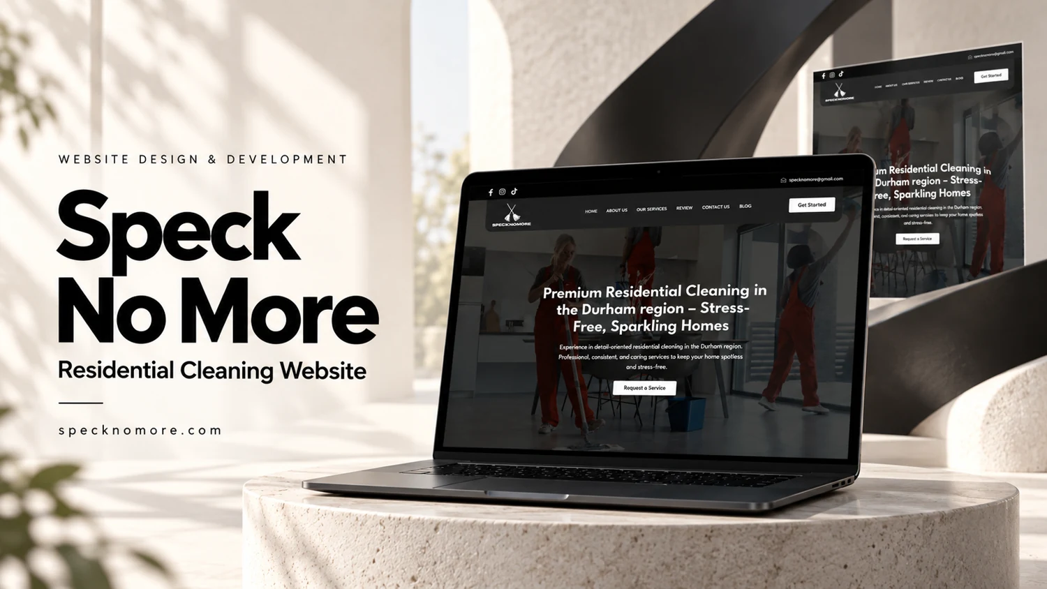
    SpeckNoMore introduces residential cleaning in the Durham region and leads with a home-focused service proposition. Navigation includes company information, services, reviews, contact, and a blog. An email address and social links provide additional contact context. The homepage contains review cards with names, star displays, short summaries, and expansion controls for longer entries. A supplied reference image and captured page evidence support this analysis.

    Design rationale

    The content concentrates on reassurance for customers inviting a provider into their home. Reviews and service explanations can work together if service scope is equally easy to find. Review expansion controls should retain the visitor’s place and remain usable by keyboard. Testimonials are treated here as displayed website content, without independently confirming authorship or customer experience.

    Trust within a local service journey

    The headline identifies both the service and the Durham region, allowing a household visitor to assess basic relevance immediately. The navigation then creates a progression from understanding the company to checking services and reviews. A blog provides a separate route for educational material, but core booking questions should not depend on reading editorial posts. Useful service content would distinguish the scope of a visit, preparation expectations, and how a request is handled. These are recommendations for decision support rather than claims that those details are already present on every page.

    Making review content usable

    The review-card format is readable in small pieces, and the longer-review buttons allow more detail without making every card equally tall. A consistent expansion behavior matters because visitors may compare several entries. The evidence includes both social links and an email address; these help a visitor recognize where to continue a conversation, although the review itself did not send any messages. A strong contact destination would carry the visitor’s service interest forward. The portfolio value here lies in combining a geographically explicit introduction, visible service navigation, and an approachable reassurance layer while keeping testimonial statements separate from verified business results.

    The review navigation and homepage review cards should lead to a consistent source of feedback. That consistency would help visitors understand whether they are reading a short selection or the complete set made available by the business.