
Cleaning & Restoration
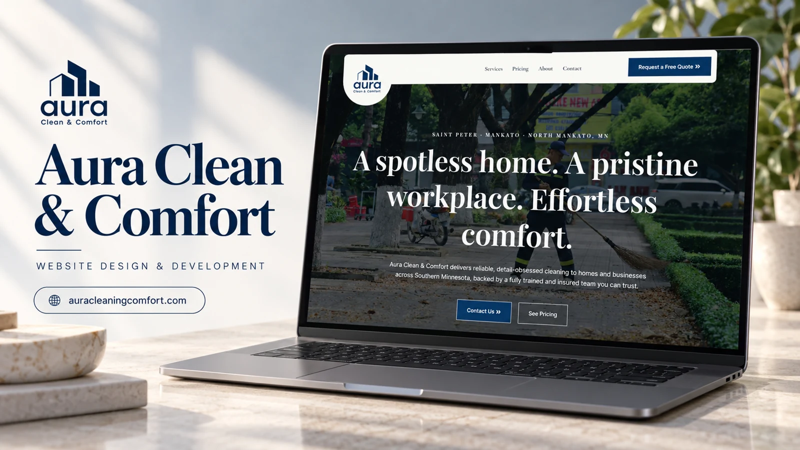
Aura Clean & Comfort
Aura Clean & Comfort identifies Saint Peter, Mankato, and North Mankato in Minnesota as its service area.
SpeckNoMore introduces residential cleaning in the Durham region and leads with a home-focused service proposition.
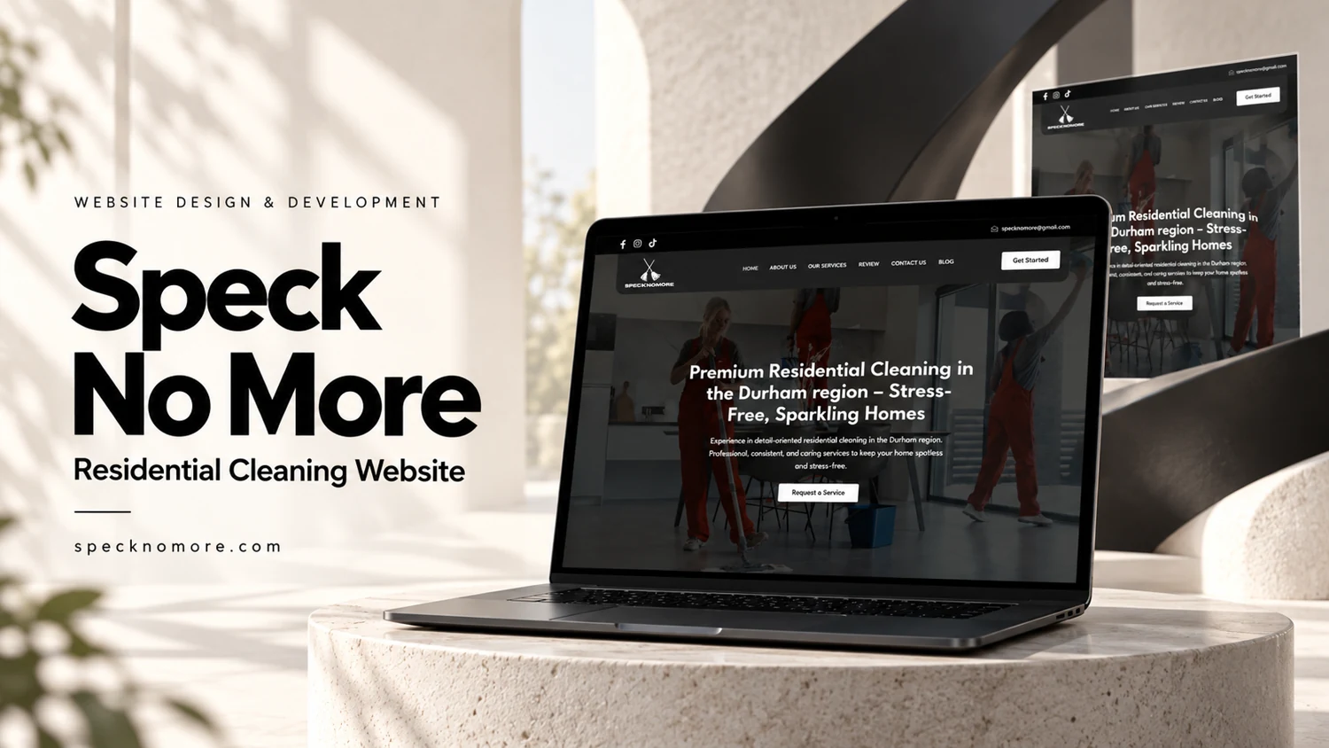
SpeckNoMore introduces residential cleaning in the Durham region and leads with a home-focused service proposition. Navigation includes company information, services, reviews, contact, and a blog. An email address and social links provide additional contact context. The homepage contains review cards with names, star displays, short summaries, and expansion controls for longer entries. A supplied reference image and captured page evidence support this analysis.
The content concentrates on reassurance for customers inviting a provider into their home. Reviews and service explanations can work together if service scope is equally easy to find. Review expansion controls should retain the visitor’s place and remain usable by keyboard. Testimonials are treated here as displayed website content, without independently confirming authorship or customer experience.
The headline identifies both the service and the Durham region, allowing a household visitor to assess basic relevance immediately. The navigation then creates a progression from understanding the company to checking services and reviews. A blog provides a separate route for educational material, but core booking questions should not depend on reading editorial posts. Useful service content would distinguish the scope of a visit, preparation expectations, and how a request is handled. These are recommendations for decision support rather than claims that those details are already present on every page.
The review-card format is readable in small pieces, and the longer-review buttons allow more detail without making every card equally tall. A consistent expansion behavior matters because visitors may compare several entries. The evidence includes both social links and an email address; these help a visitor recognize where to continue a conversation, although the review itself did not send any messages. A strong contact destination would carry the visitor’s service interest forward. The portfolio value here lies in combining a geographically explicit introduction, visible service navigation, and an approachable reassurance layer while keeping testimonial statements separate from verified business results.
The review navigation and homepage review cards should lead to a consistent source of feedback. That consistency would help visitors understand whether they are reading a short selection or the complete set made available by the business.
Aura Clean & Comfort identifies Saint Peter, Mankato, and North Mankato in Minnesota as its service area.
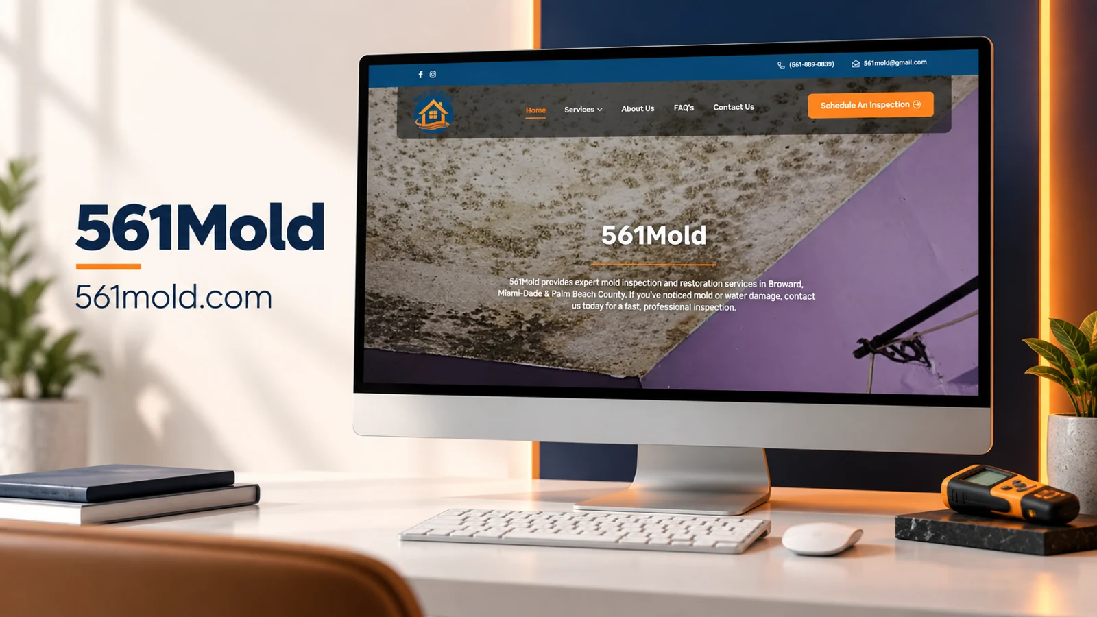
A mold inspection and restoration website with a direct scheduling route.

A supplied exterior-cleaning reference combines a vivid service identity with a prominent enquiry action.