Project Categories: Business & Consulting

  • Mygration Station

    Mygration Station

    Website analysis and design rationale

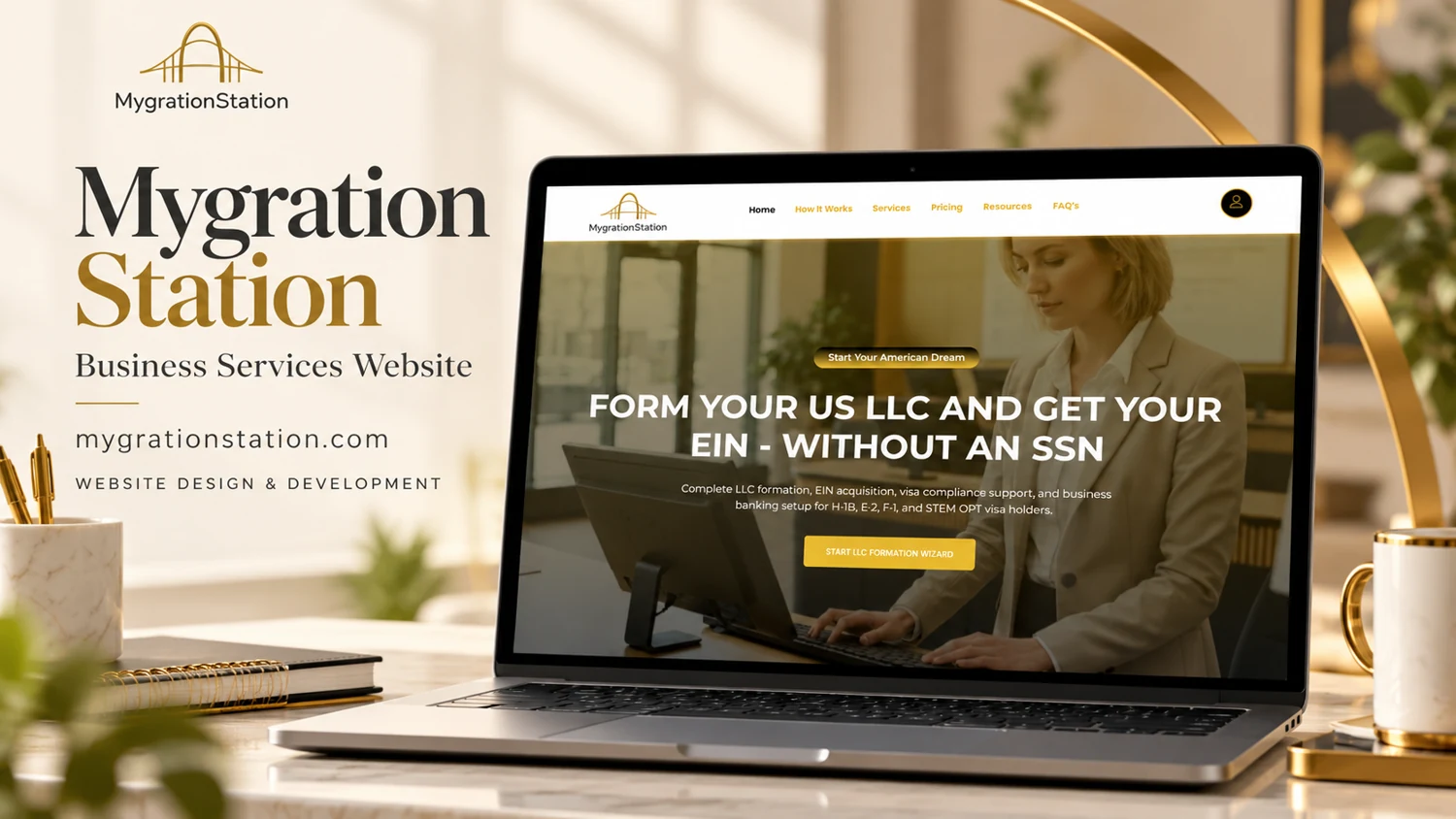
    A business-formation homepage directs visitors from a defined service proposition into a guided starting process.

    Audience and purpose

    A visitor confronting an unfamiliar formation process is likely to look for sequence, cost, and required documentation. How It Works, Pricing, and FAQs provide natural places for those answers. The wizard action creates a clear starting point, but its surrounding explanation is important because a prominent button alone cannot communicate the implications of submitting personal information.

    Observed presentation

    The reviewed page promotes US LLC formation and EIN assistance for people without a Social Security number. It also mentions banking setup and visa-related support. Navigation separates How It Works, Services, Pricing, Resources, and FAQs, with a dashboard destination. A prominent action opens an LLC-formation wizard.

    Visual direction

    The reference uses cream, gold, and a calm business setting. A photographic hero carries a highly specific headline, making the intended visitor need easy to identify. The combination of process, pricing, and FAQ navigation suggests an information journey that can address questions before a visitor begins the guided flow.

    Design rationale

    Because the subject intersects with business and immigration decisions, service scope and professional boundaries need precise wording. Clear explanations of required information, fees, and what happens after submission would support informed use. This analysis describes the visible website structure and does not endorse legal eligibility claims or validate formation outcomes.

    Analysis based on the captured public homepage and supplied reference; authorship and business results were not established.
  • Faryad Holdings Inc.

    Faryad Holdings Inc.

    Website analysis

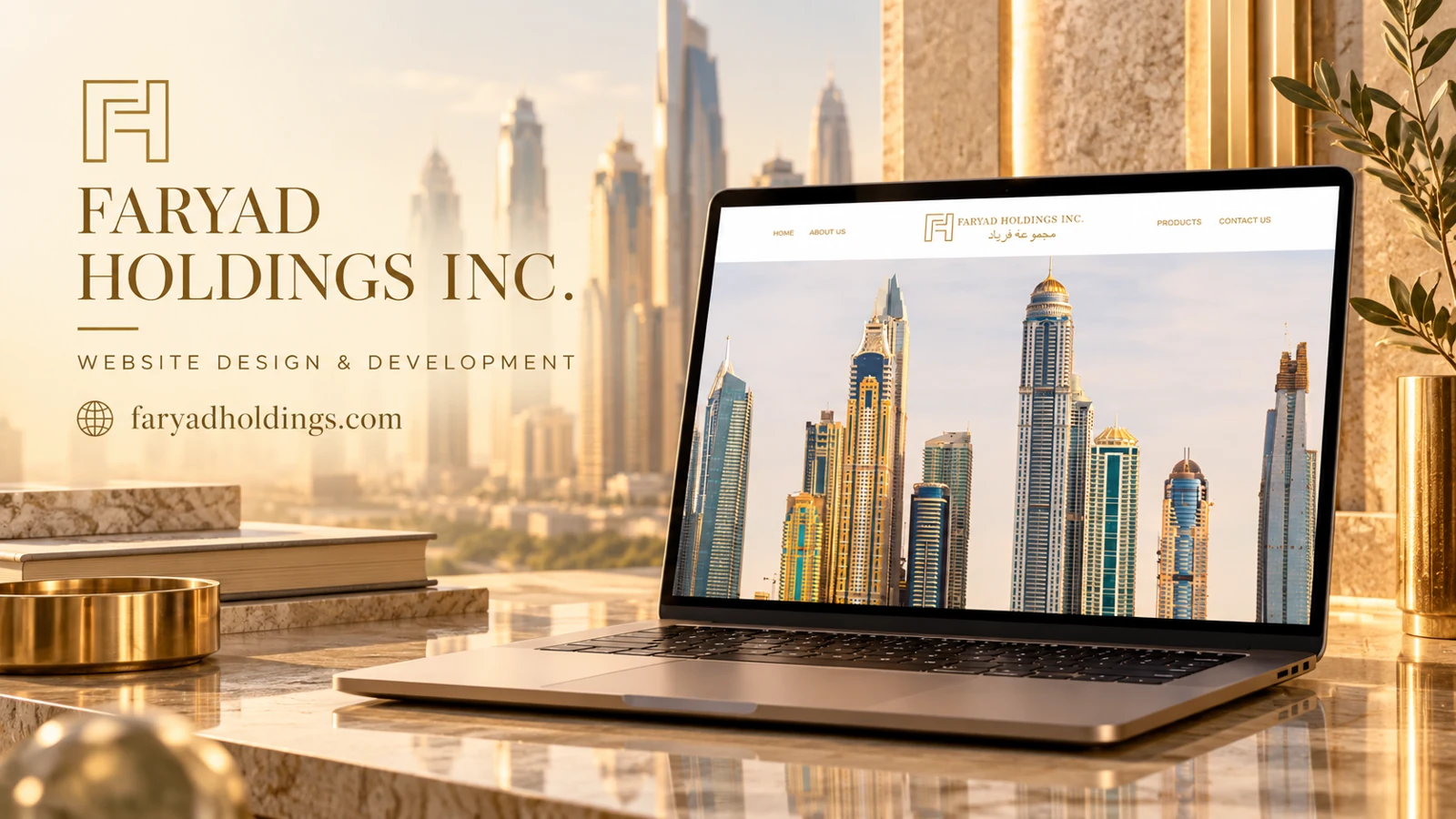
    Faryad Holdings Inc. uses a centered bilingual wordmark in a white header, with navigation arranged on either side. Gold lettering connects the identity to a large architectural skyline image. The captured navigation offers Home, About Us, Products, and Contact Us. The page representation also lists clocks for Dubai, New York, London, Singapore, Hong Kong, and Zurich.

    Design rationale

    The visual treatment communicates an international corporate tone through architecture, restrained color, and global time references. Those design signals do not establish offices or operating coverage in the named cities. The available capture provides little detail about the product offering, so the strongest analysis concerns presentation and navigation rather than unverified business activities. A clear product introduction would connect the atmosphere to practical understanding.

    An international visual vocabulary

    The skyline fills most of the captured viewport, giving architecture more emphasis than descriptive body copy. The centered identity and balanced navigation create a formal composition, while gold lettering introduces a restrained luxury cue. The bilingual wordmark broadens the visual identity without requiring the menu itself to carry two languages in the captured view. These are observable presentation choices. They suggest an intended corporate character, but they do not prove the location of the business, its legal structure, or the nature of its holdings.

    Making the next layer informative

    The Products link is the clearest hint of a more concrete offering, and the About Us route can explain the organization behind the image. A homepage refinement could bring a short factual introduction into the first-screen experience so the visitor knows what to seek next. The city clocks add an international motif; they should be labeled in a way that does not imply an office network unless that is accurate. Contact is an appropriate final route once the offer is understood. The portfolio analysis therefore centers on the balance between visual atmosphere and explanatory content, rather than inventing product categories or business reach.

    The unusually image-led opening makes the header especially important. Its four destinations must carry the initial orientation burden until explanatory content appears, so clear menu contrast and predictable link behavior are central to this particular first-screen design.

  • Smalls Strategic Services

    Smalls Strategic Services

    Website analysis

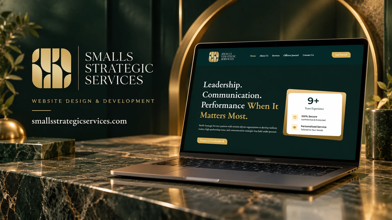
    Smalls Strategic Services addresses leadership, communication, and team performance for mission-driven organizations. The homepage offers a consultation action and describes work with leaders and teams operating under pressure. Main navigation includes services, company background, contact, and an Officers Journal. The captured content also displays experience, confidentiality, and personalized-service messaging as credibility cues.

    Design rationale

    The combination of a consultation route and a journal supports two different visitor needs: immediate contact and slower assessment of expertise. The design rationale is to connect abstract themes such as resilience and communication to clear service descriptions. Confidentiality language should remain specific enough to be meaningful, while journal content can demonstrate the perspective and vocabulary of the practice.

    Explaining an advisory offer

    Leadership, communication, and performance are connected topics, but an organization may approach them with very different needs. A service page should help a visitor distinguish an individual leadership engagement from team development or communication support. The homepage’s mission-driven language provides an audience cue without requiring a long list of sectors. Its emphasis on performance under pressure gives the proposition a particular context. A useful editorial extension would explain the form of an engagement and the questions covered in an initial conversation, while avoiding invented methodologies or unsupported promises about organizational change.

    Expertise beyond the sales page

    The Officers Journal creates a place for sustained ideas and practical perspective. It can help readers assess the voice of the practice before requesting a consultation. The key design relationship is between that slower reading journey and the direct contact path: neither should obscure the other. Confidentiality and personalization statements can reduce hesitation, but they work best alongside concrete information about handling inquiries. The captured experience marker is a displayed website claim, not a verified career history. This entry therefore focuses on how the information is arranged and how the audience is addressed rather than attributing outcomes to an engagement.

    The journal title carries a particular professional tone. A brief description of its intended readership and themes could help visitors outside that immediate context decide whether it contains material relevant to their own leadership or communication challenges.

  • Bawks Corporation

    Bawks Corporation

    Website analysis

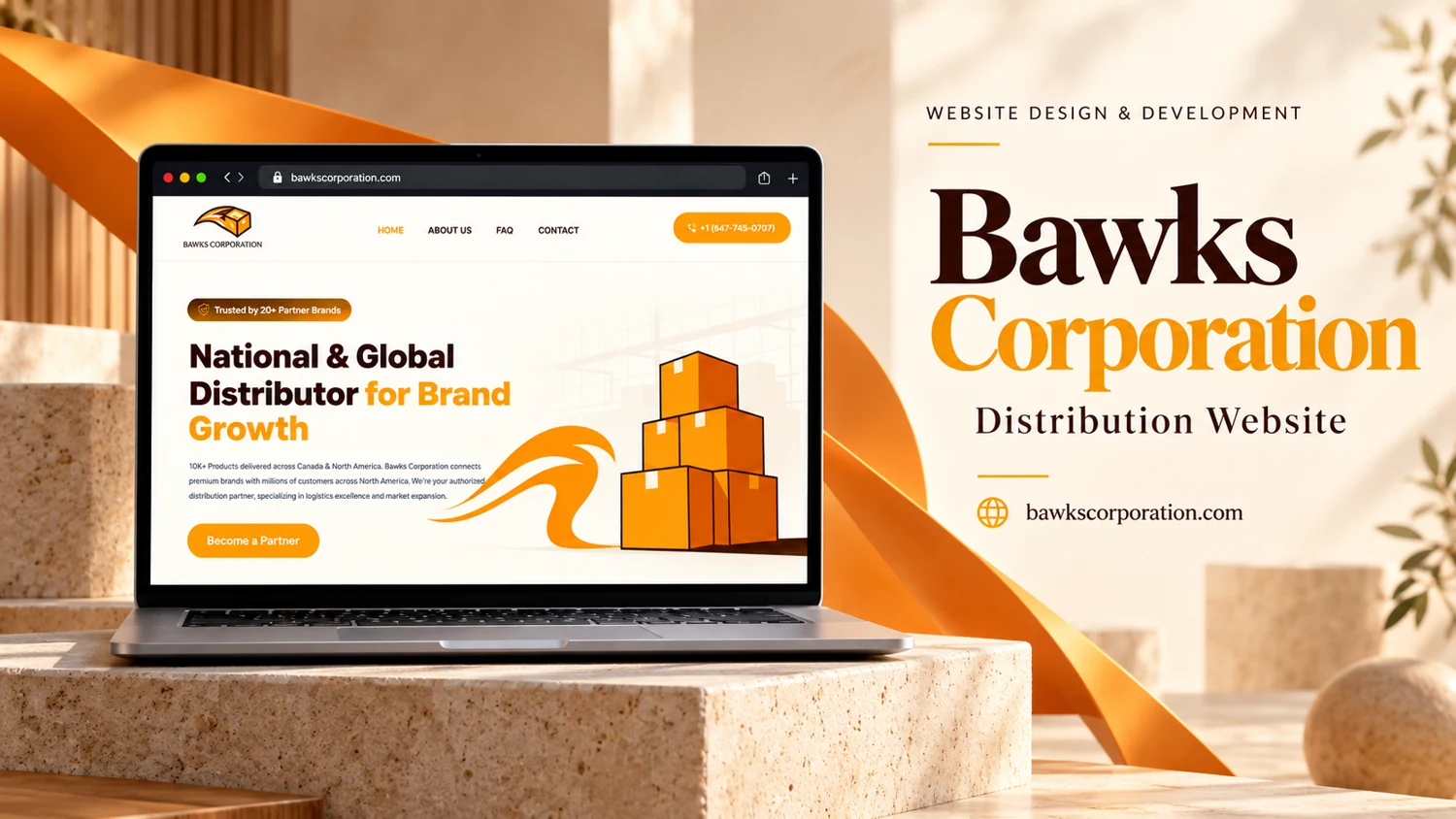
    The supplied portfolio image shows a cream and orange homepage with a box illustration, simple navigation, a phone action, and a Become a Partner button. Its introduction positions the organization around national and global distribution and brand growth. The live capture returned a gateway error.

    Information and visitor journey

    The box motif translates distribution into a recognizable visual cue. The warm accent color repeats across the illustration and primary action, connecting the offer with the next step. The restrained menu keeps the initial presentation focused on business introduction and contact.

    Design rationale

    The reference contains quantitative trust claims that have not been independently verified. A fuller case study should confirm coverage, services, partner requirements, and the source of any performance figures before reproducing them as facts.

    Presentation and audience

    The reference places a compact trust badge above the headline and a partnership action below the introductory paragraph. The illustration sits to the right, balancing the text without competing with the orange call to action. A light warehouse-like line drawing provides context while retaining substantial blank space around the main message. The result is a business-to-business introduction that relies on clarity of positioning and a direct conversation route.

    The top navigation is limited to Home, About Us, FAQ, and Contact, alongside a telephone button. This suggests a small informational website rather than a catalogue or shipment-tracking product. The most useful supporting pages would explain who can partner, what distribution responsibilities are offered, and how an inquiry is assessed. Those are proposed content priorities inferred from the visible partnership action; they are not evidence of a completed operational workflow.

    Website analysis based on the observed page or supplied reference; no client brief, authorship, or measured outcomes are asserted.