
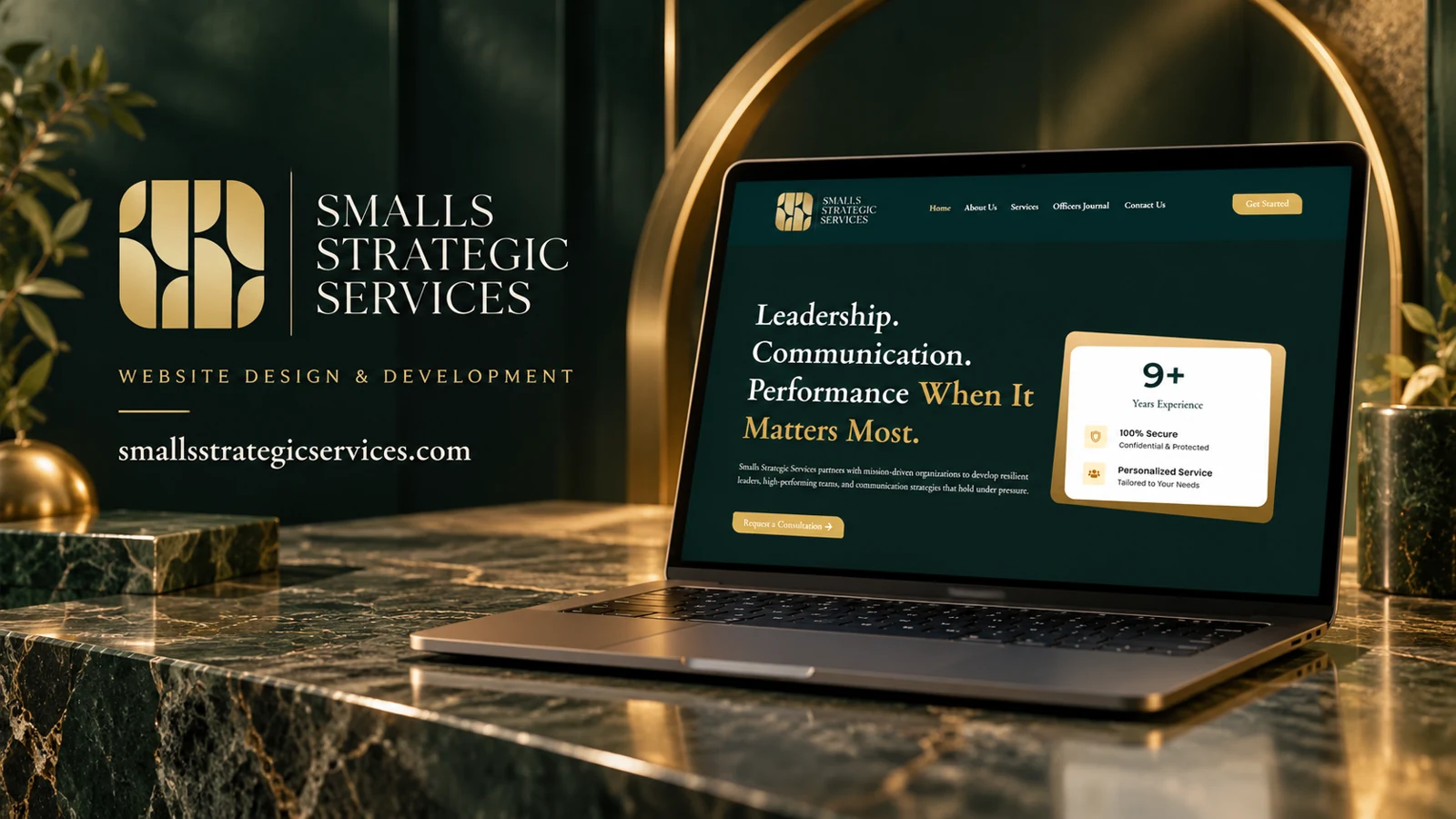
Business & Consulting
Smalls Strategic Services
Smalls Strategic Services addresses leadership, communication, and team performance for mission-driven organizations.
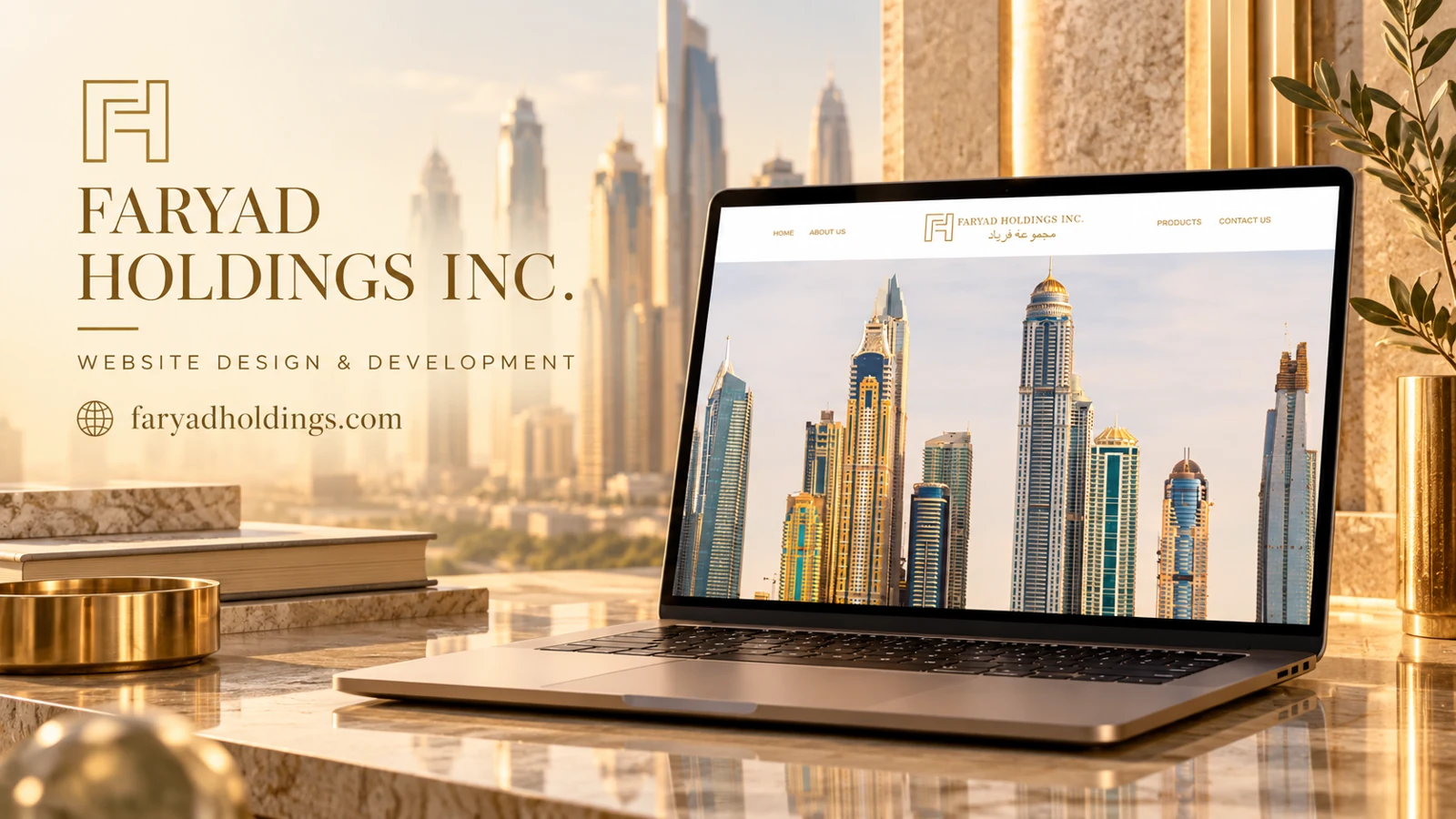
Faryad Holdings Inc. uses a centered bilingual wordmark in a white header, with navigation arranged on either side. Gold lettering connects the identity to a large architectural skyline image. The captured navigation offers Home, About Us, Products, and Contact Us. The page representation also lists clocks for Dubai, New York, London, Singapore, Hong Kong, and Zurich.
The visual treatment communicates an international corporate tone through architecture, restrained color, and global time references. Those design signals do not establish offices or operating coverage in the named cities. The available capture provides little detail about the product offering, so the strongest analysis concerns presentation and navigation rather than unverified business activities. A clear product introduction would connect the atmosphere to practical understanding.
The skyline fills most of the captured viewport, giving architecture more emphasis than descriptive body copy. The centered identity and balanced navigation create a formal composition, while gold lettering introduces a restrained luxury cue. The bilingual wordmark broadens the visual identity without requiring the menu itself to carry two languages in the captured view. These are observable presentation choices. They suggest an intended corporate character, but they do not prove the location of the business, its legal structure, or the nature of its holdings.
The Products link is the clearest hint of a more concrete offering, and the About Us route can explain the organization behind the image. A homepage refinement could bring a short factual introduction into the first-screen experience so the visitor knows what to seek next. The city clocks add an international motif; they should be labeled in a way that does not imply an office network unless that is accurate. Contact is an appropriate final route once the offer is understood. The portfolio analysis therefore centers on the balance between visual atmosphere and explanatory content, rather than inventing product categories or business reach.
The unusually image-led opening makes the header especially important. Its four destinations must carry the initial orientation burden until explanatory content appears, so clear menu contrast and predictable link behavior are central to this particular first-screen design.
Smalls Strategic Services addresses leadership, communication, and team performance for mission-driven organizations.

A supplied distribution-website reference using orange accents and a partnership call to action.
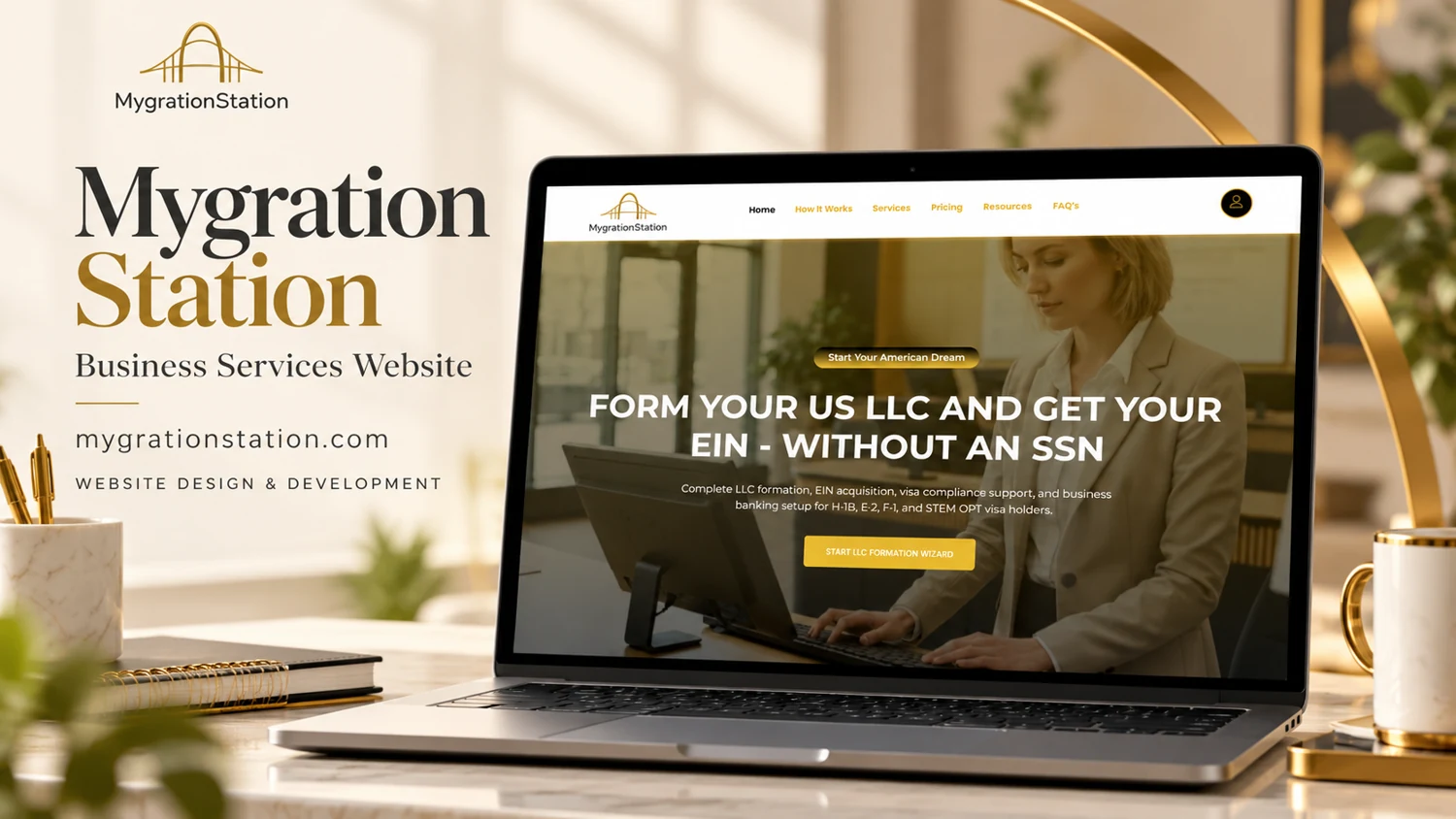
A business-formation homepage directs visitors from a defined service proposition into a guided starting process.