Project Categories: Technology & AI

  • heytina

    heytina

    Website analysis

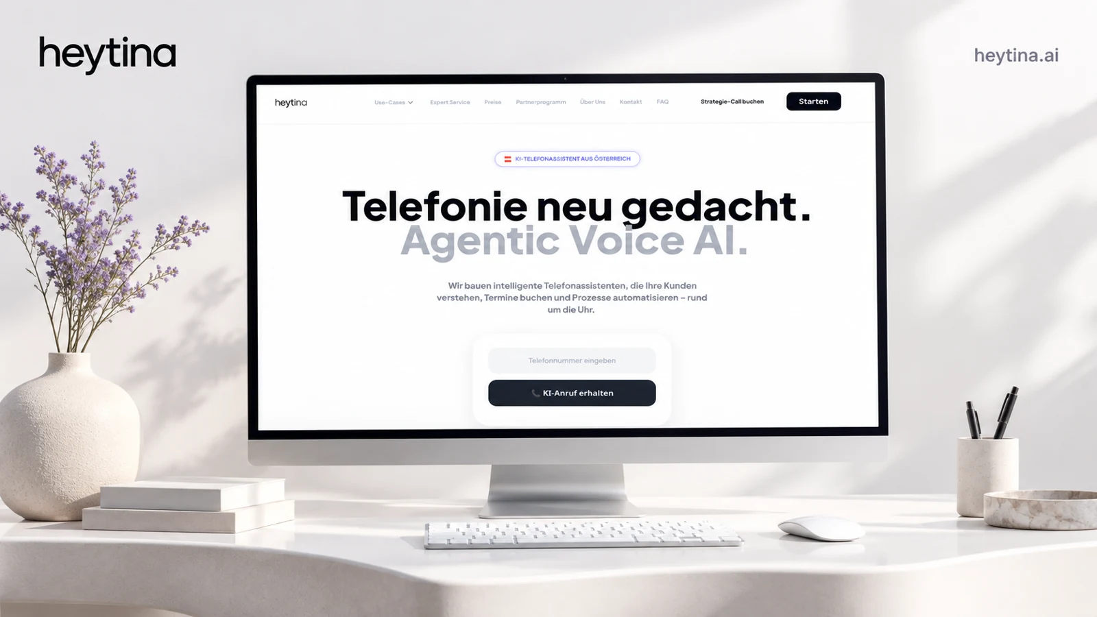
    The public homepage presents an Austrian AI telephone assistant. Navigation groups appointment handling, support, receptionist functions, and industry-specific pages. The main journey includes a test-call prompt, strategy-call booking, and a platform entry point. Integration and privacy sections support the product explanation.

    Information and visitor journey

    A demonstration is especially relevant for a voice product because the experience is difficult to convey through written claims alone. Industry routes let visitors translate a general capability into familiar workflows. The managed-service section distinguishes tailored assistance from self-service exploration.

    Design rationale

    Claims about hosting, privacy compliance, availability, and integrations should remain attributed to the provider unless independently audited. A useful product page should show the boundary between a sample demonstration and a configured production workflow.

    Presentation and audience

    The clean screenshot shows a mostly white interface with an oversized black headline, pale gray secondary headline, and restrained violet accents. The hero centers a telephone-number field and a dark demonstration button beneath the product explanation. Unlike a conventional software page dominated by dashboard screenshots, this composition places the relevant experience—a phone interaction—at the center of the first screen.

    The header separates use cases, expert service, pricing, partnership, company information, contact, and FAQ. Strategy-call booking and platform entry receive distinct emphasis. That allows the same page to serve exploratory visitors, buyers wanting managed implementation, and users ready to start. The demonstration form also displays privacy and contact-consent context; a design review should retain that context beside the action rather than separating it into a distant policy page.

    Website analysis based on the observed page or supplied reference; no client brief, authorship, or measured outcomes are asserted.

  • EchoCheck Technologies

    EchoCheck Technologies

    Website analysis

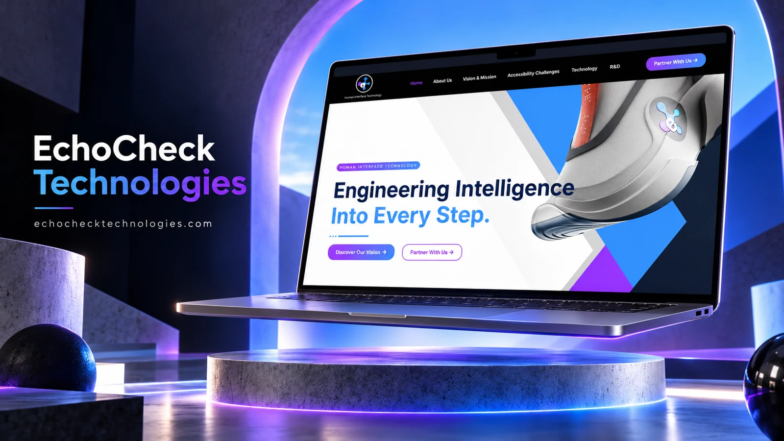
    The site describes its subject as human interface technology. Navigation includes About Us, Vision and Mission, Accessibility Challenges, Technology, and R&D. Discover Our Vision and Partner With Us are prominent actions, alongside an image carousel and contact links.

    Information and visitor journey

    The information structure allows a visitor to move from the problem space to the technical approach and then to collaboration. This is appropriate for a developing technology story where education and partnership may matter more than an immediate purchase.

    Design rationale

    Technical explanations should distinguish demonstrated capabilities, research questions, and future ambitions. Accessibility-related statements need clear context and should not imply independently verified effectiveness merely because the page discusses accessibility.

    Presentation and audience

    The refreshed homepage image uses a close-up product rendering, angular white and blue shapes, and purple-to-blue gradient actions. A black header separates the navigation from the bright hero. The typography is large and direct, with the second line of the central statement emphasized in blue. This makes the introduction feel product-led even though the navigation contains substantial research and mission material.

    The product rendering gives visitors a tangible visual anchor for an otherwise abstract human-interface proposition. However, a rendering alone does not establish commercial availability or tested capabilities. The vision and partnership routes should therefore carry the explanatory burden: what is being explored, what is already demonstrated, and what kind of collaboration is sought. The accessibility and R&D sections are especially useful places to make those distinctions clear.

    Website analysis based on the observed page or supplied reference; no client brief, authorship, or measured outcomes are asserted.

  • TEKPRO.ai

    TEKPRO.ai

    Website analysis

    TEKPRO.ai presents enterprise platforms and services for operational intelligence, energy management, and infrastructure monitoring. Its homepage foregrounds deployment on the customer’s infrastructure and data sovereignty. Navigation separates platforms, services, industries, company information, careers, and contact. Request a Demo and Talk to an Expert provide clear commercial routes. The captured page also includes an embedded YouTube player, and a supplied reference image is available.

    Design rationale

    The site addresses an audience likely to care about architecture and deployment as much as broad benefits. Platform, service, and industry routes can help different stakeholders find a relevant level of detail. The design rationale is to connect the enterprise promise to specific use cases, while making expert contact available to visitors whose questions require a technical conversation.

    Routes for different enterprise readers

    Platforms, Services, and Industries are distinct navigation concepts. A technical evaluator may begin with a platform, an operations lead may begin with a problem, and an executive may begin with an industry context. Keeping these routes connected can prevent the same proposition from being repeated without additional depth. The homepage’s emphasis on real-time intelligence and customer-controlled infrastructure gives those routes a common center. A useful content progression would connect each use case to a platform explanation and then to deployment questions, while carefully distinguishing publicly stated capability from verified implementation evidence.

    Explaining rather than merely presenting

    The embedded video creates an opportunity to demonstrate complex material, but the central proposition should also remain available in text. Readers need to understand the main offer without depending on playback, sound, or a third-party player. The demo and expert-contact actions address different kinds of readiness: a guided view of the product versus a more specific discussion. Their destinations should preserve that distinction. Data sovereignty is an important part of the observed positioning, yet a homepage statement alone does not establish security controls or deployment guarantees. This portfolio entry assesses the communication structure without certifying the underlying technology or customer outcomes.

    Careers sits alongside commercial navigation, indicating an additional audience beyond prospective customers. Keeping that route available but distinct can support recruitment without complicating the primary journey from platform or industry information toward a demonstration or technical conversation.

  • BizAI Inc.

    BizAI Inc.

    Website analysis

    BizAI presents AI-assisted marketing through a direct message about content generation, campaign automation, and business growth. The observed navigation separates company information, features, AI platforms, and pricing, while the header exposes phone and email contact routes. A prominent contact action provides an immediate next step. The captured page also contains a testimonial carousel; its numerical claims are website statements, not independently verified outcomes.

    Design rationale

    The relationship between the broad marketing promise and the platform menu is the central design question. Clear examples of inputs, outputs, and review steps would help visitors understand what automation actually means for their team. Pricing and platform links can serve different levels of readiness without forcing an early sales conversation.

    From promise to product understanding

    A visitor arriving with a marketing workload needs to distinguish the platform itself from any accompanying service. The Features and AI Platforms navigation labels create the basis for that distinction, but the opening message is deliberately broad. One useful next layer would group examples by task: drafting material, coordinating a campaign, and reviewing generated output. These are suggested content directions, not confirmed product capabilities beyond the homepage language. Each example could connect a recognizable marketing problem to the appropriate platform page. The pricing route then becomes meaningful because a reader can compare the scope behind an offer.

    A focused inquiry journey

    The phone, email, and contact button give visitors multiple ways to start a conversation. Their usefulness depends on a coherent destination: the contact section should make clear whether a visitor is asking for a demonstration, pricing guidance, or implementation support. The carousel introduces social proof, but repeated slides in the capture make it important to assess the rendered reading order separately from the visual animation. Testimonial metrics should retain attribution. For this portfolio, the significant design lesson is the relationship among a concise headline, a product-information menu, and a reachable human contact.

    For a future content map, the distinction between Features and AI Platforms deserves explicit ownership: one should explain what can be done, while the other identifies the tools or products through which a visitor can do it.