Website analysis and design rationale
A supplied digital-education reference uses a calm editorial presentation around knowledge and practical skills.
Audience and purpose
A learner needs to know what knowledge or skill a program actually teaches before evaluating an aspirational promise. The calm visual tone can make the subject approachable, but a useful course presentation would connect each topic to concrete learning content. That distinction is especially valuable when the headline also mentions financial independence.
Observed presentation
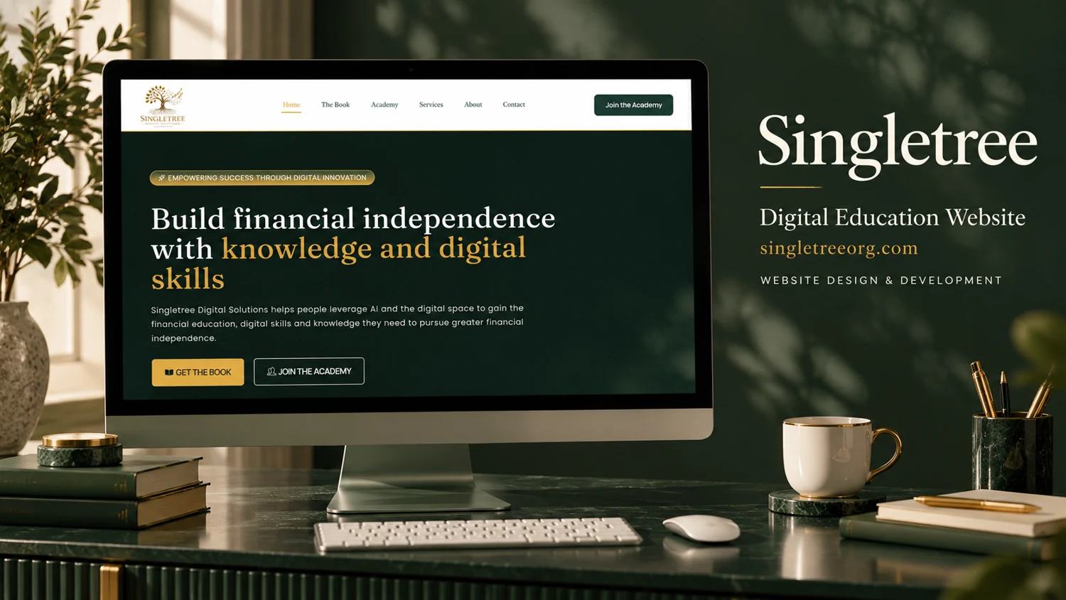
The cover identifies Singletree as a digital-education website. The visible screen presents a headline connecting financial independence with knowledge and digital skills, supported by short introductory text and two actions. Public retrieval was unsuccessful, so course offerings, enrollment requirements, pricing, and account functionality are not verified.
Visual direction
Forest green, cream, desk objects, and natural shadows give the reference a study-oriented atmosphere. The website shown within the screen uses generous headline scale and a restrained palette. This creates an accessible starting point for an educational message without requiring a dense first-screen catalogue.
Design rationale
A useful continuation would distinguish learning topics, intended audiences, formats, and prerequisites. Any statements about financial outcomes should be carefully supported and should not replace clear descriptions of the educational material. This analysis interprets the visible presentation only; it does not validate earnings claims, student outcomes, or the existence of particular courses.
Reference-based analysis: the live page was not fully accessible, so current content and interactions remain unverified.