Project Categories: Real Estate

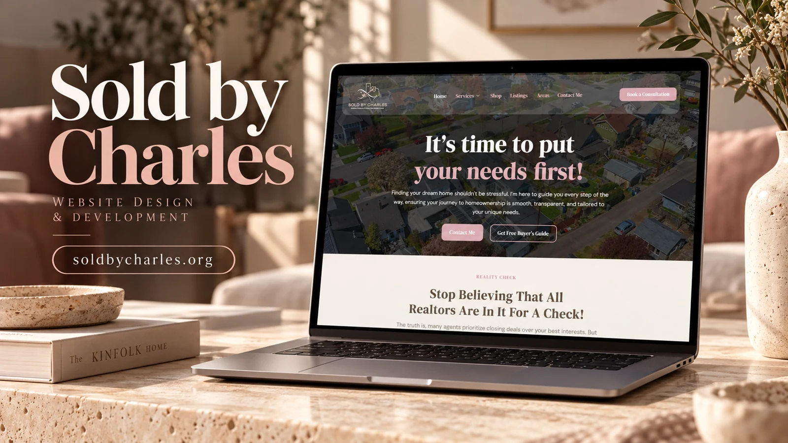
  • Sold by Charles

    Sold by Charles

    Website analysis

    The captured Sold by Charles content includes local-area cards for Dallas, Midlothian, DeSoto, and Cedar Hill in Texas. Cards combine a place name, descriptive copy, imagery, and a details action. The homepage also contains a testimonial carousel with previous and next controls. Together these elements indicate an emphasis on neighborhood exploration and customer reassurance within a real-estate context.

    Design rationale

    Area information is a useful bridge between a broad property search and an individual conversation. The cards should help visitors compare communities through consistent questions, rather than simply providing different lengths of promotional copy. The capture shows testimonials but does not verify transactions, sale prices, or customer identities. Those claims should not be converted into portfolio performance results.

    Local discovery through comparable cards

    The area cards are a useful way to organize place-based information because the visitor can scan several communities without leaving the page. Their value increases when each answers comparable questions. For example, a consistent editorial structure could separate the character of an area, its amenities, and the next research step. The captured descriptions vary in tone and detail, so a content pass could make comparison more balanced. Housing suitability should remain a visitor-led decision; area copy should describe places accurately without assuming who should live in them.

    From exploration to a conversation

    View Details gives each community a possible deeper route, while the testimonial carousel addresses reassurance at a different point in the journey. Those layers should connect to a clear inquiry action for someone who has identified an area of interest. The recorded testimonials include both buying and selling stories, but they should not be repurposed as verified case-study results. Their role in this analysis is simply evidence that the site uses social proof. The design rationale is to let a visitor learn about places and then ask a specific question, with consistent card labels and accessible carousel controls preserving the flow of exploration.

    The details buttons should name or retain their community context for assistive technology. Several identical button labels can be difficult to distinguish when read independently, even when their relationship to a nearby card is visually obvious on screen.

  • Three Threshold Acquisitions

    Three Threshold Acquisitions

    Website analysis

    Three Threshold Acquisitions describes a cross-sector investment approach spanning real estate, hospitality, technology, equipment, and specialty operating businesses. The homepage introduces acquisition strategy before presenting a focus list. Its navigation includes About Us, Team, Invest With Us, and Contact Us, establishing separate routes for company research and potential investment conversations. The site’s financial positioning is an observed communication choice, not a performance finding.

    Design rationale

    The page has an editorial task: explain a broad acquisition thesis without making every sector appear equally generic. A clear focus list supports initial scanning, while team and strategy pages can supply the depth expected by a professional audience. The relevant design rationale is disciplined information hierarchy and easy access to the people and process behind the proposition.

    Organizing a broad investment thesis

    The focus list spans assets with very different operating characteristics. Real estate, hospitality, technology equipment, and specialty services cannot be explained by a single example, so the homepage benefits from a shared narrative about selection and execution. The observed copy supplies that narrative through research, underwriting, repositioning, and operating potential. A reader can first understand the investment lens, then choose a sector for more detail. Any future expansion should make clear whether examples represent current holdings, target opportunities, or past leadership experience; those are different kinds of evidence and should not be visually interchangeable.

    Credibility and investor navigation

    The Team route is especially significant because the site emphasizes complementary leadership expertise. The Invest With Us route addresses a different intent from a general company inquiry, and its destination should explain what information is available before any commitment is considered. Contact remains the appropriate bridge for questions that cannot be answered publicly. From a design perspective, the key is a measured progression from thesis to focus to people and process. Financial language should stay precise, with no implication that attractive presentation establishes expected returns. No acquisition performance or investor outcome was independently assessed in this review.

    Sector-specific examples would be most useful when tied back to the shared acquisition criteria. Otherwise, a broad list can communicate ambition without helping a reader understand why these different asset types belong within the same investment proposition.