Project Categories: Landscaping & Environment

  • Grass Valley Recycling

    Grass Valley Recycling

    Website analysis

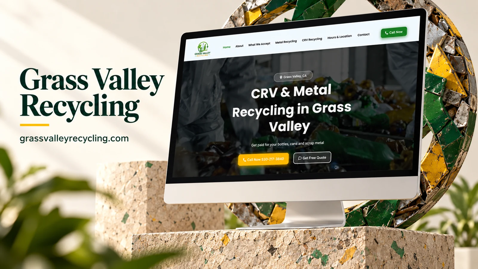
    The captured homepage describes recycling for individuals and businesses in Grass Valley. Visible feature headings refer to certified scales, fast drop-off, payment on the spot, and community cleanliness. A Call Now action is exposed in the header.

    Information and visitor journey

    The content emphasizes practical reasons to visit rather than an extensive brand narrative. For this type of service, operational details are likely to determine whether someone can use the facility. A phone action offers a direct route for questions that the short page does not answer.

    Design rationale

    Accepted materials, preparation requirements, opening hours, directions, and payment conditions would make the journey more complete. Statements about certification and payments should be supported by current operational information.

    Presentation and audience

    The refreshed screenshot adds clear CRV and metal-recycling positioning. The header includes What We Accept, Metal Recycling, CRV Recycling, and Hours & Location. These are useful task labels because a visitor is often deciding whether a particular load can be brought to the site and when. A location badge places Grass Valley, California, directly above the main heading.

    The hero uses a darkened recycling photograph, a large white heading, and a bright yellow call button paired with an outlined quote action. Green in the logo and header action supplies the environmental association, while yellow makes immediate contact stand out. The reference is particularly suited to a local-service case study about fast orientation: identify material type, check practical visit information, and ask a question before making the trip.

    Website analysis based on the observed page or supplied reference; no client brief, authorship, or measured outcomes are asserted.
  • GroundFlow

    GroundFlow

    Website analysis

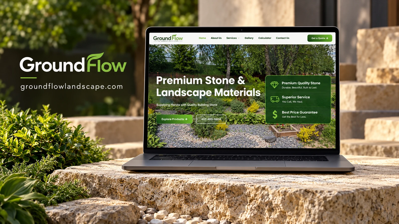
    The capture identifies GroundFlow as a stone supplier serving Central Florida. Navigation includes services, gallery, calculator, and contact. Product imagery, a Get a Quote action, and statements about quality, hauling, and pricing form the main commercial structure.

    Information and visitor journey

    The gallery helps visitors understand material appearance while the calculator suggests a quantity-planning step. Together these routes can connect visual preference with practical purchasing preparation. Homeowners and contractors may need different quantities and delivery details.

    Design rationale

    Material pages should identify product names, dimensions, intended applications, and ordering units. Calculator assumptions should be visible. Testimonials are present in the capture, but this analysis does not independently authenticate their authors or reported experiences.

    Presentation and audience

    The fresh capture shows a landscaped garden as the full-width background, with stone visibly integrated into the planting. A green-and-white identity links the logo, navigation, product action, and a three-part benefit panel. The hero leads with stone and landscape materials, while a phone number provides an alternative to browsing. This makes the product category understandable without requiring the visitor to know a technical material name.

    The benefit panel separates material quality, hauling service, and pricing into easily scanned rows with icons. These are different purchasing considerations, so the division is useful even though the underlying claims need supporting detail. A contractor ordering bulk material may proceed directly to quotation, whereas a homeowner may need the gallery and calculator first. The design accommodates both by keeping discovery tools in the main navigation.

    Website analysis based on the observed page or supplied reference; no client brief, authorship, or measured outcomes are asserted.

  • Nieves Landscape

    Nieves Landscape

    Website analysis

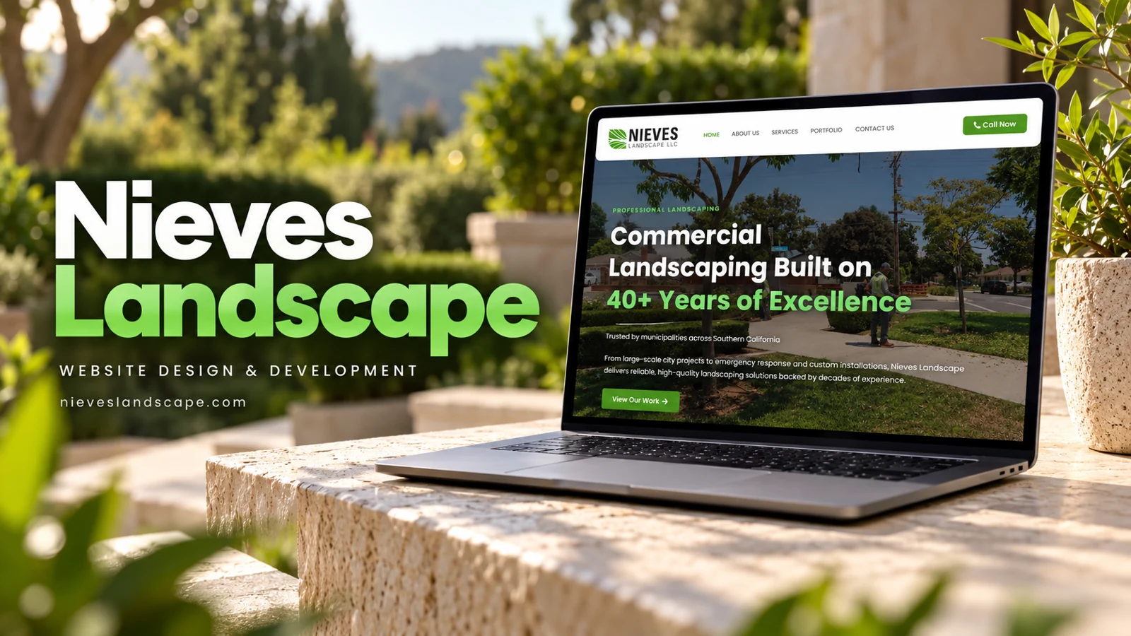
    Nieves Landscape positions its offering around commercial landscaping and Southern California municipalities. The homepage describes maintenance, emergency response, and custom installation work. Navigation includes company information, services, portfolio, and contact. Its service selector distinguishes municipal landscaping, commercial maintenance, irrigation, construction, design, emergency work, and one-time beautification. The page also displays professional-association references as part of its credibility presentation.

    Design rationale

    The organization of services reflects multiple procurement needs rather than a single residential package. A municipal visitor may need capability information, while a property manager may first need maintenance coverage. Portfolio and service routes can support both. The observed years-of-experience and membership statements remain claims made by the website; this analysis does not independently certify them.

    A capability presentation for larger properties

    Municipal and commercial audiences often need to understand the breadth of a provider before discussing an individual job. The observed service list supports that task by including ongoing maintenance, irrigation, construction, and emergency work. The homepage also points toward a portfolio, creating a place where relevant examples could give the categories practical meaning. Any such examples should be clearly labeled by project type and documented scope. The available capture does not establish which projects the organization completed, so the portfolio route is analyzed as information architecture rather than evidence of specific work.

    Multiple inquiry needs in one structure

    Emergency service and planned maintenance have different time sensitivities. A coherent contact journey should make those differences visible without implying a response guarantee that has not been confirmed. The recorded Call Now and View Our Work links use placeholder-style destinations, making destination verification a concrete follow-up item. The association references and experience headline contribute to the page’s credibility narrative but require accurate maintenance. The design lesson is to support professional evaluation through a clear capability map, relevant proof when available, and dependable contact routes. This review did not test procurement processes, service delivery, or the organization’s operational coverage.

    The service list gives emergency work the same selector status as planned projects. A brief explanation beside the selection could help users understand whether the contact route is monitored for urgent situations or is intended only for ordinary inquiries.

  • MBRIDGEH20 Landscaping

    MBRIDGEH20 Landscaping

    Website analysis

    The MBRIDGEH20 homepage introduces landscaping and lawn-care services, with Book Now and Get a Free Quote actions. A service-area section asks for a United States ZIP code and pairs the availability control with an interactive map. The service selector lists mowing, landscaping, mulch, trimming, seasonal cleanups, weed control, and residential or commercial work. The captured phone action has an empty telephone destination.

    Design rationale

    Coverage checking is a distinctive functional element because it can answer an important question before a visitor invests effort in an inquiry. Its labels and response states should be especially clear on mobile. The map and form need to work together without requiring map interaction. The empty call destination is a concrete item to verify during any future functional review.

    Geography before commitment

    The ZIP-code availability check answers a practical question that many local-service websites leave until the contact stage. It can reduce wasted effort if the result clearly states coverage and offers a sensible next step. The map provides spatial context, but a typed code should be enough for a visitor who cannot or prefers not to manipulate the map. Error and no-coverage states would need direct language. These are recommended interaction qualities; the review did not submit a location or verify the service-area database.

    A service menu that supports scoping

    The selector combines routine maintenance, seasonal work, and broader landscaping. That range gives visitors a place to start, while an Other option allows needs that do not fit the list. Book Now and Get a Free Quote may represent different stages, so their destinations should explain whether they request an appointment or only begin an estimate. A clear distinction would be especially helpful for work whose scope depends on the property. The MBRIDGEH20 name appears prominently in the header and footer, making consistency between the domain, visible brand, and contact confirmation useful. No actual appointment or quote was requested during the analysis.

    The presence of account access beside booking suggests a possible returning-customer journey, but the capture does not verify its function. Its label should explain why someone might sign in instead of making a new service inquiry through the public form.