Project Categories: Events & Entertainment

  • T&K Events Rentals

    T&K Events Rentals

    Website analysis and design rationale

    An event-rental introduction uses inventory browsing and quote requests as its two principal visitor routes.

    Audience and purpose

    An event planner may enter with an exact equipment list, while a private host may still be exploring a visual direction. The separate inventory and quote actions accommodate those different starting points. The celebratory styling creates an appropriate first impression, but an effective catalogue must also make quantity, availability, and delivery questions manageable.

    Observed presentation

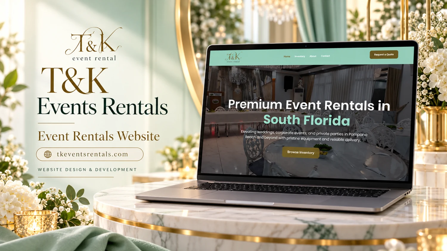
    The reviewed homepage promotes event rentals in South Florida and mentions weddings, corporate events, and private parties around Pompano Beach. Navigation includes Home, Inventory, About, and Contact. A prominent quote button and an inventory action appear in the first screen. Some captured links still reference a separate staging-style domain.

    Visual direction

    The supplied reference uses mint green, pale gold, flowers, and a formal table setting. These elements visually situate the site within celebratory events. The laptop display contains a photographic hero, a large service-area statement, and an accent button, giving the opening screen an immediately recognizable rental-business purpose.

    Design rationale

    Inventory categories should help planners understand available equipment before making an enquiry. A quote form could collect event date, venue, quantities, and delivery requirements. The captured cross-domain links need a destination check before publication so the inventory and contact journeys remain consistent with the public website address.

    Analysis based on the captured public homepage and supplied reference; authorship and business results were not established.
  • Velvet Moments Events

    Velvet Moments Events

    Website analysis

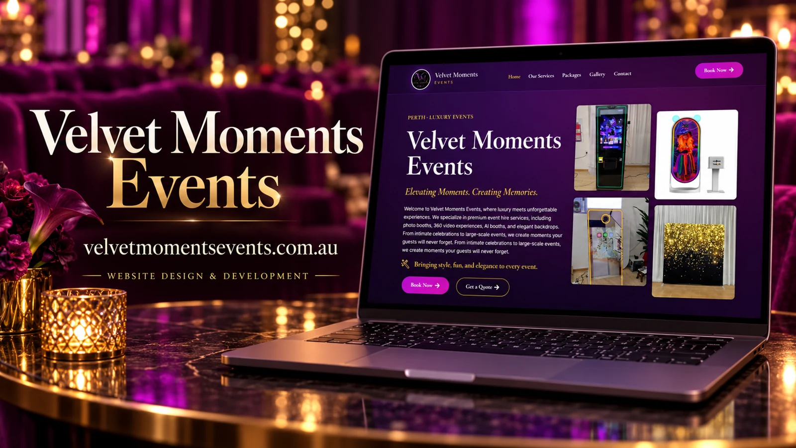
    Velvet Moments Events presents event-hire services in Perth, with a homepage that names photo booths, 360 video experiences, AI booths, and backdrops. The captured header separates Our Services, Packages, Gallery, and Contact, alongside a prominent Book Now button. A second booking action and a quote action appear in the hero. The recorded package selector includes Silver, Gold, Platinum, and Custom options. These are observed labels rather than independently confirmed package specifications.

    Visual identity

    The first screen uses a deep purple background with gold accents and bright magenta actions. Large white serif type introduces the brand, while a staggered group of equipment photographs shows several booth formats and a backdrop. This makes the offering more concrete than a purely atmospheric event photograph would. The dark palette and gold details support the site’s luxury positioning, and the colorful equipment imagery adds an entertainment cue. The logo, headings, and button treatment form a recognizable visual hierarchy.

    From inspiration to a suitable package

    Services and Packages represent different questions: what equipment or experiences are offered, and how they are grouped for hire. Keeping those destinations distinct can help a visitor move from interest to comparison. The Gallery gives a further route for seeing the presentation in context. A useful next layer would explain the contents and differences of each package using verified details. The Custom option can then serve inquiries that do not fit the standard groupings, without forcing visitors to choose a misleading tier just to start a conversation.

    Inquiry design rationale

    The homepage offers both booking and quote language, so the destinations should clarify whether a visitor is requesting availability or making a confirmed reservation. Event date, venue context, and the desired experience would be relevant scoping topics if the business chooses to collect them. These are recommendations, not a description of uninspected form fields. The introductory paragraph repeats a sentence in the captured view; removing that repetition would make the first screen more concise. The analysis concerns the observed website presentation and inquiry paths only. It does not claim event delivery, customer results, equipment availability, or authorship of the original design.

  • Lotto African

    Lotto African

    Website analysis

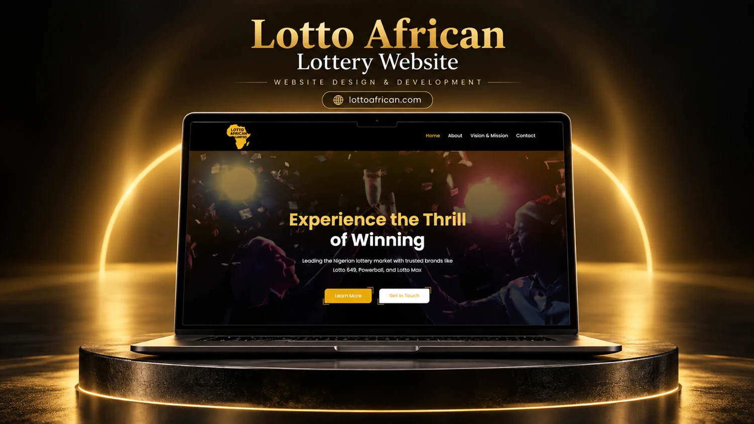
    The supplied image presents a lottery website with Home, About, Vision and Mission, and Contact navigation. A centered hero uses a celebratory background, gold and white headline treatment, and Learn More and Get in Touch actions. Live content could not be retrieved during this review.

    Information and visitor journey

    The reference emphasizes brand introduction rather than displaying a verified transactional flow. Two actions separate further reading from direct contact. The dark overlay gives the central message a defined reading area against an energetic photograph.

    Design rationale

    Any published presentation should distinguish the visible corporate introduction from unverified ticketing functionality. Operating permissions, eligibility, rules, and responsible-play information cannot be established from this single image. The design analysis therefore makes no claim about licensing, payout performance, or availability.

    Presentation and audience

    The supplied composition places the brand logo at the left of a black header and a short menu at the right. In the hero, the heading is centered over a darkened celebration image. Gold highlights the first line and the primary reading action, while a white contact button provides a contrasting secondary route. The hierarchy is simple: brand, introductory message, short explanation, and next step.

    The two actions imply that visitors may either learn about the organization or ask a question. Nothing in the reference demonstrates account registration, draw entry, payment, or ticket checking, so these should not be included in an implementation narrative. A fuller informational review would look for clear explanations of the organization and its operating context. The portfolio image remains useful as evidence of the visible black-and-gold direction and centered introductory composition.

    Website analysis based on the observed page or supplied reference; no client brief, authorship, or measured outcomes are asserted.