Website analysis and design rationale
A supplied welding-gear reference combines a dark industrial presentation with a shopping-oriented page structure.
Audience and purpose
A shopping audience needs to move from brand atmosphere to product comparison. The welding theme establishes relevance quickly, but apparel sizing and technical equipment specifications serve different decisions. Clear category separation would help the industrial visual identity support selection rather than forcing every item into the same presentation pattern.
Observed presentation
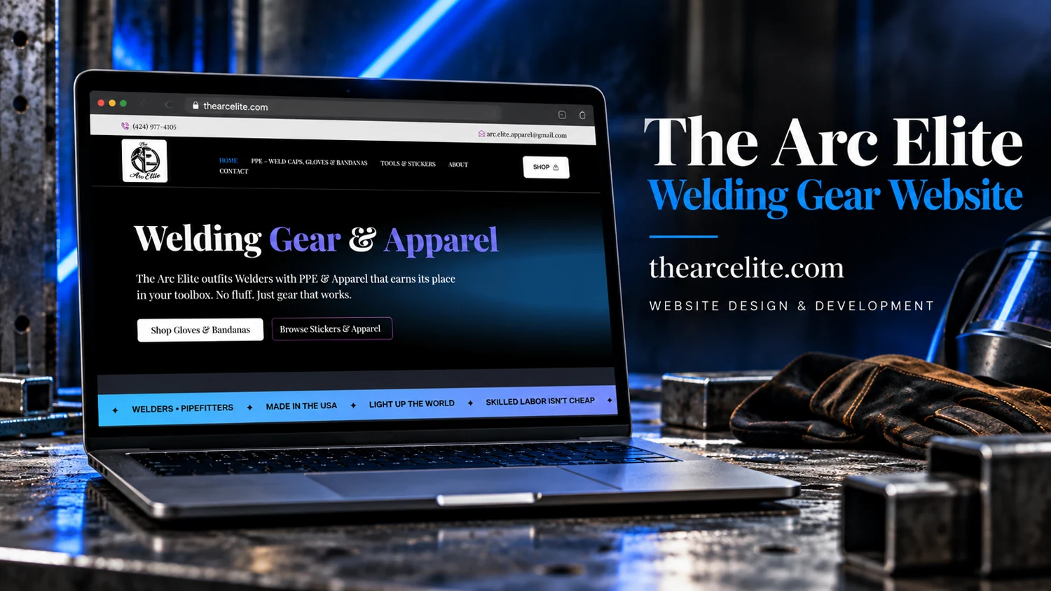
The provided cover identifies The Arc Elite as a welding gear website. The screen headline refers to welding gear and apparel, with a pale navigation bar, dark hero, and contrasting actions. A live browser request timed out. Product availability, categories, cart behavior, and checkout functionality remain unverified.
Visual direction
Blue light, metal textures, and protective equipment frame the supplied composition. The screen uses high contrast and a restrained first-screen layout, connecting the store identity to an industrial audience. The distinction between a visually expressive hero and a lighter navigation area helps orient a visitor within the reference.
Design rationale
A useful product experience would surface specifications, size guidance, materials, and clear shipping or return information. Any protective-performance claims require accurate manufacturer support. These are evaluation criteria for a future review, not confirmed store features. The supplied image supports a visual analysis but cannot establish the safety or suitability of merchandise.
Reference-based analysis: the live page was not fully accessible, so current content and interactions remain unverified.