Project Categories: Community & Nonprofit

  • Rise Again Housing

    Rise Again Housing

    Website analysis and design rationale

    A mission-led transitional housing page connects a clear statement of purpose with donation and contact routes.

    Audience and purpose

    The housing message has to work for people seeking support and people considering a contribution. The repeated donation action is clear for the second group. The locations and contact route are useful for the first, although a resident-facing explanation of the next step would give the opening statement more practical value.

    Observed presentation

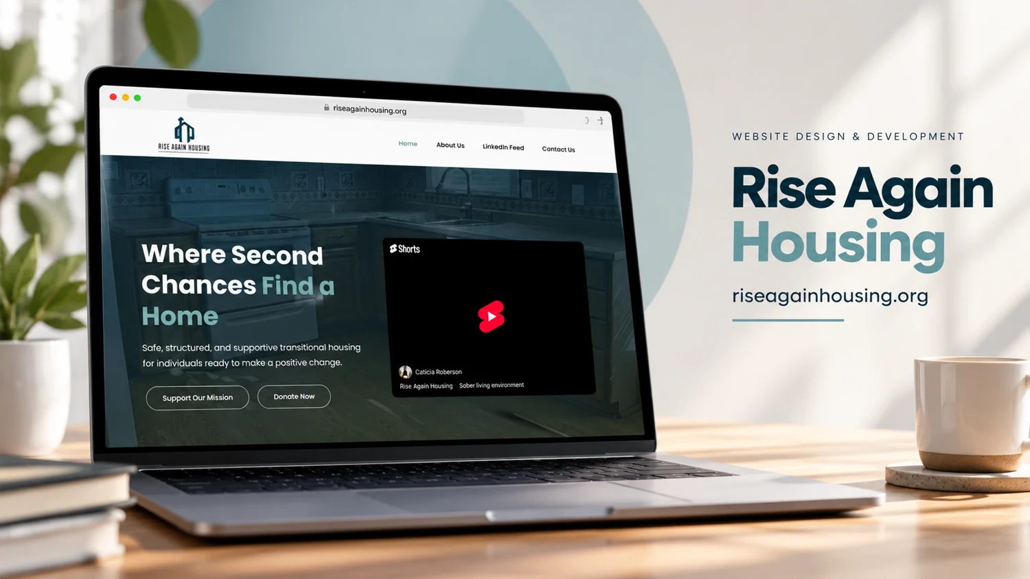
    The observed homepage describes structured transitional housing for people seeking positive change. Its navigation includes About Us, a LinkedIn feed, and Contact Us. Donation links lead to a hosted payment page, and an embedded video introduces the housing environment. The footer lists Bryan, Marlin, and Galena Park in Texas.

    Visual direction

    The supplied cover combines a light neutral environment with a dark blue-green website hero. The visible headline foregrounds second chances, while the page separates mission copy from the embedded video. Contact information and locations in the footer provide practical context alongside the emotional introduction.

    Design rationale

    Residents, referral partners, and donors have different questions. A useful content structure would make eligibility, referral steps, available support, and donation purpose easy to distinguish. The observed donation links establish a route to support, but payment completion, current housing availability, and outcomes were not tested or independently confirmed.

    Analysis based on the captured public homepage and supplied reference; authorship and business results were not established.
  • Essential Life Skills

    Essential Life Skills

    Website analysis

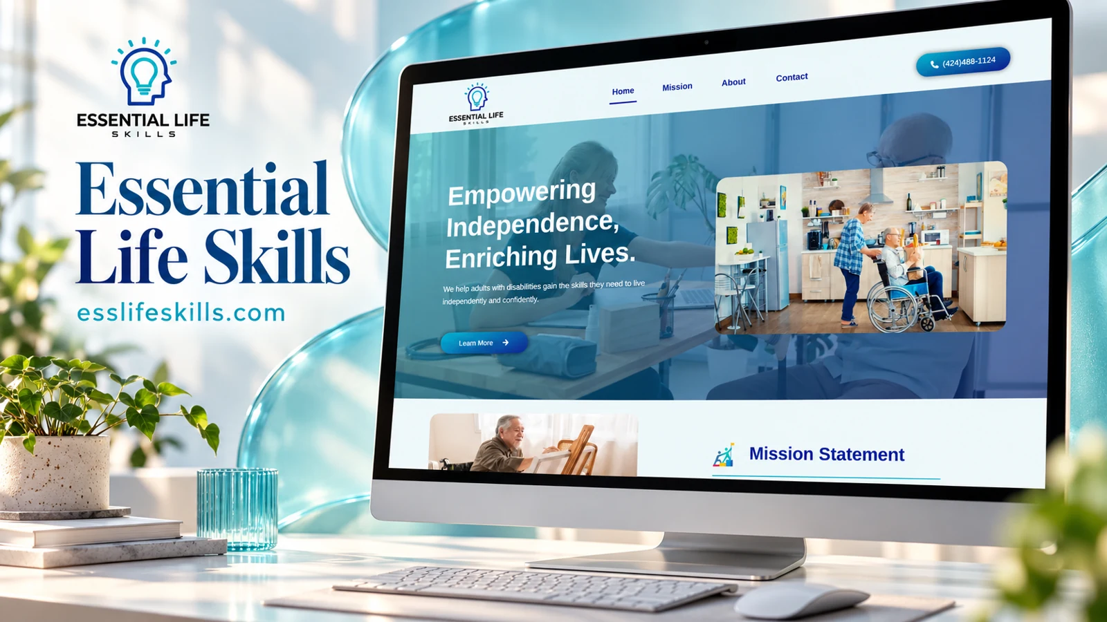
    The homepage describes support for adults with developmental disabilities who want to build independent-living skills. Mission, About, and Contact links support the introduction. The entrance criteria discuss regional-center referral, adult eligibility, individual preference, and review of whether the program can meet a person’s needs.

    Information and visitor journey

    This content serves prospective participants, advocates, and referral coordinators. Separating the mission from eligibility gives different readers a way to find practical information without losing the purpose of the service. The visible phone action makes personal clarification possible.

    Design rationale

    Referral steps should use plain language and distinguish required information from optional context. Timelines and eligibility wording should be checked regularly with the service provider. The website presentation does not itself verify regulatory standing or individual suitability.

    Presentation and audience

    The intended readers have different relationships to the service. An adult considering support may focus on independence and everyday confidence; an advocate may need to understand the entrance process; a coordinator may need referral criteria. The homepage places these considerations within one short structure, using an encouraging introduction before more detailed eligibility content. This is a practical balance between purpose and procedure.

    The entrance section is particularly important because it avoids making the visitor infer eligibility from general promotional language. It explains that acceptance involves review and the program’s ability to meet individual needs. A stronger presentation can preserve that nuance while making the steps easier to scan: referral, information review, conversation, and decision. The site’s contact route then becomes a place for clarification rather than a substitute for all essential information.

    Website analysis based on the observed page or supplied reference; no client brief, authorship, or measured outcomes are asserted.

  • Northway Life

    Northway Life

    Website analysis

    The captured header provides Home, Services, Why Northway, and Contact Us. A Contact Northway action uses an email link, and a team-hands image appears in the captured document. A later fully rendered capture clarified the non-clinical support, education, and training offer.

    Information and visitor journey

    Services and Why Northway create separate paths for understanding the offer and evaluating the organization. A direct email action is simple, but visitors still need sufficient context to decide whether their question belongs here.

    Design rationale

    A fuller review should establish the service category from approved business copy before adding sector-specific claims. The primary introduction should answer who is served, what support is offered, and how an initial inquiry works.

    Presentation and audience

    A fresh browser view clarifies the offer: Northway describes non-clinical support, education, and training for individuals, families, professionals, and communities navigating life transitions. The hero uses a cream background, sage-green accents, generous spacing, and large serif typography. A photograph of supportive hands occupies a separate rounded panel, creating a calm two-column composition rather than placing text over a busy scene.

    Contact Northway is paired with Explore Services. This gives a visitor permission to learn before reaching out and makes the service explanation a central part of the journey. The visible non-clinical wording is an important boundary for the presentation: the site should explain support accurately without implying medical treatment. The broader audience list also suggests that service pages should distinguish individual assistance from professional education or community training.

    Website analysis based on the observed page or supplied reference; no client brief, authorship, or measured outcomes are asserted.

  • Caring Hearts Sanctuary

    Caring Hearts Sanctuary

    Website analysis

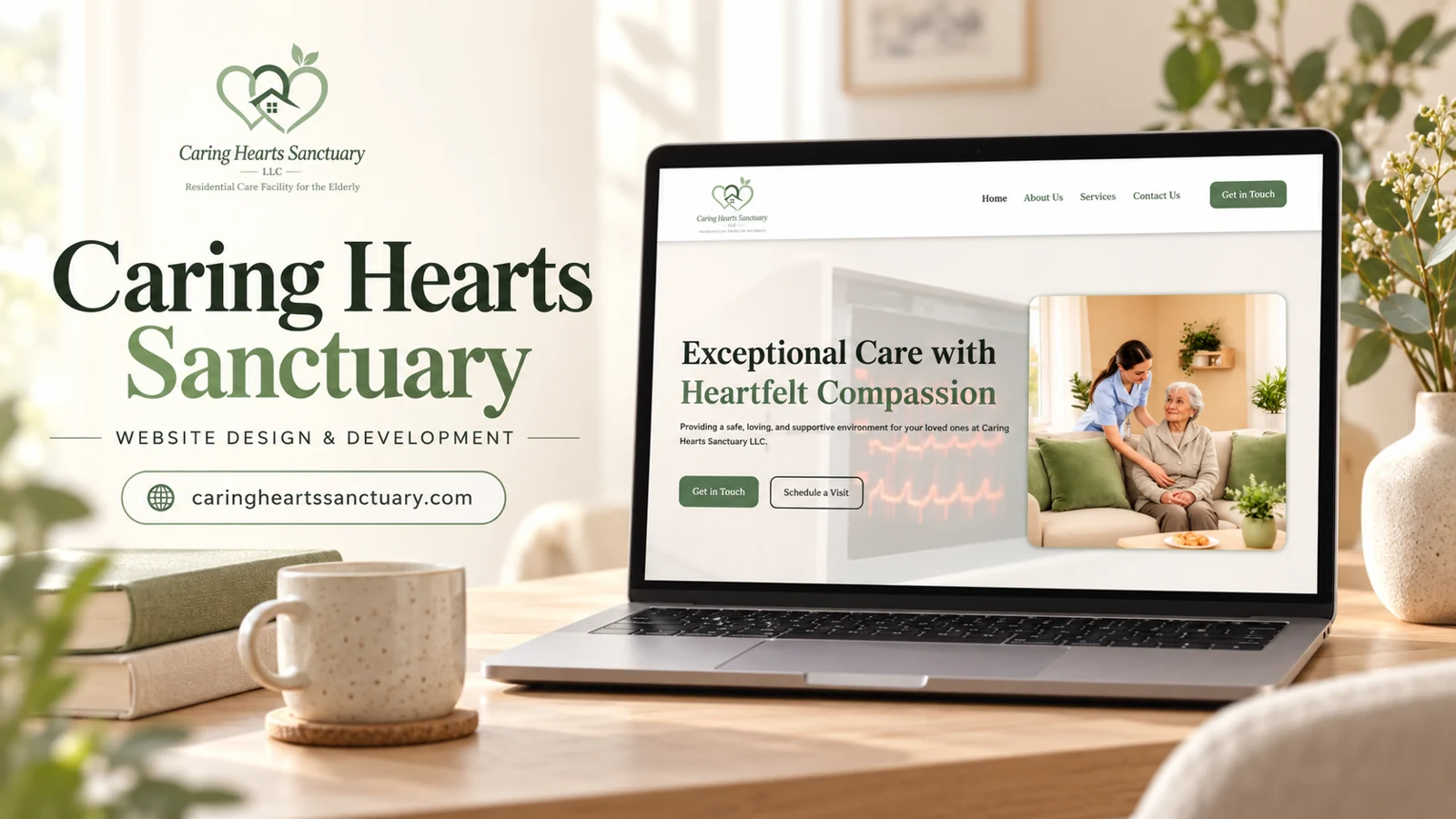
    The captured Caring Hearts Sanctuary homepage identifies a residential care facility for older adults through its logo subtitle. The first screen pairs a compassionate-care message with an image of a caregiver and an older woman. Green accents, warm neutral backgrounds, and a clear two-column composition set a calm tone. Navigation includes Home, About Us, Services, and Contact Us, with Get in Touch and Schedule a Visit actions.

    Design rationale

    The two calls to action support different levels of readiness: an initial question and an in-person visit. That distinction is appropriate for a considered family decision. The screenshot supports analysis of the visible page and its tone; it does not verify care quality, staffing levels, licensing, admission criteria, or available places. Those details require separately approved factual content.

    A calm introduction to a considered choice

    The first screen uses a warm neutral background rather than a stark clinical treatment. Green accents connect the heading, logo, and primary action, while the caregiver photograph gives the message a human focus. The large serif headline creates a measured, reassuring tone. A faint clinical image in the background adds a care-related context without competing strongly with the foreground. These visual choices can make the page approachable, but the content still needs to answer practical family questions. Atmosphere should support factual information about the facility rather than stand in for it.

    Supporting inquiry and a visit

    Get in Touch and Schedule a Visit describe different intentions. A family may first want to ask about suitability, while another visitor may be ready to see the setting. Keeping those routes separate can help the eventual conversation start at the right point. The Services and About Us pages offer logical places for verified information about daily support and the organization. A future content review should ensure that photographs are accurately represented and that any credentials or care claims have an approved source. This website analysis is not an assessment of clinical practice, resident experience, or whether the facility is appropriate for a particular person.

    The logo subtitle and the hero message work at different levels: one identifies the type of facility, while the other conveys the desired tone. Keeping both readable helps warmth coexist with a concrete description of the setting.