Project Categories: Arts & Creative

  • Velvet Shadows Network

    Velvet Shadows Network

    Website analysis and design rationale

    A publishing and multimedia platform separates available books, planned releases, cultural content, and a broader mission.

    Audience and purpose

    Readers who want a book and visitors exploring a wider story world should not have to follow the same path. The book cards and dedicated content areas support that separation. Keeping the published first title visually distinct from future work protects the browsing experience from confusing a creative roadmap with an available catalogue.

    Observed presentation

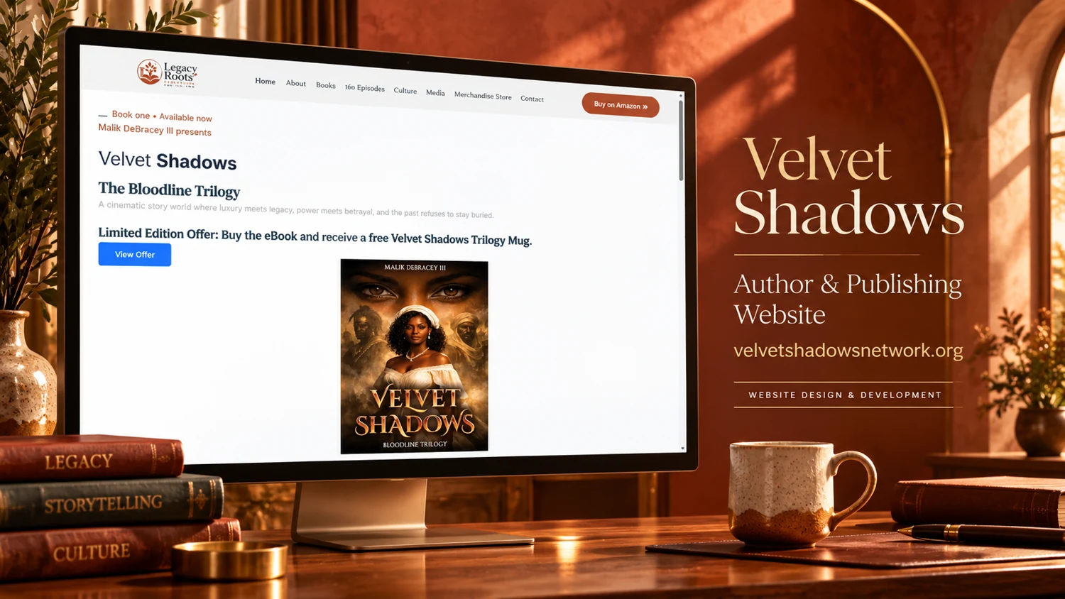
    The reviewed homepage introduces Malik DeBracey III’s Bloodline Trilogy. It distinguishes a published first book from a second title being written and a planned third title. Navigation and homepage sections connect books, a planned series, cultural storytelling, merchandise, and community-oriented mission content. Product cards include edition and enquiry controls.

    Visual direction

    The supplied cover has a warm literary presentation with books, bronze lighting, and a pale website background. The current homepage is more expansive, combining publishing, commerce, and future media plans. Clear status labels are therefore especially valuable: they help visitors distinguish material available today from concepts still in development.

    Design rationale

    The main information-design priority is maintaining those distinctions across book cards, series pages, and commerce routes. Product requests need transparent next steps, while planned seasons or future titles should remain explicitly labeled. This review does not confirm sales, fulfillment, audience reach, charitable outcomes, or the production of the proposed multimedia series.

    Analysis based on the captured public homepage and supplied reference; authorship and business results were not established.
  • Life in Colors

    Life in Colors

    Website analysis and design rationale

    A supplied paint-and-sip reference uses an expressive, social visual direction to introduce creative events.

    Audience and purpose

    An attendee choosing a creative social event may care as much about the atmosphere as the painting itself. The reference’s art materials and warm styling communicate that social setting. Practical event information would then need to turn interest into a confident choice, especially for someone unfamiliar with the activity or arranging a group.

    Observed presentation

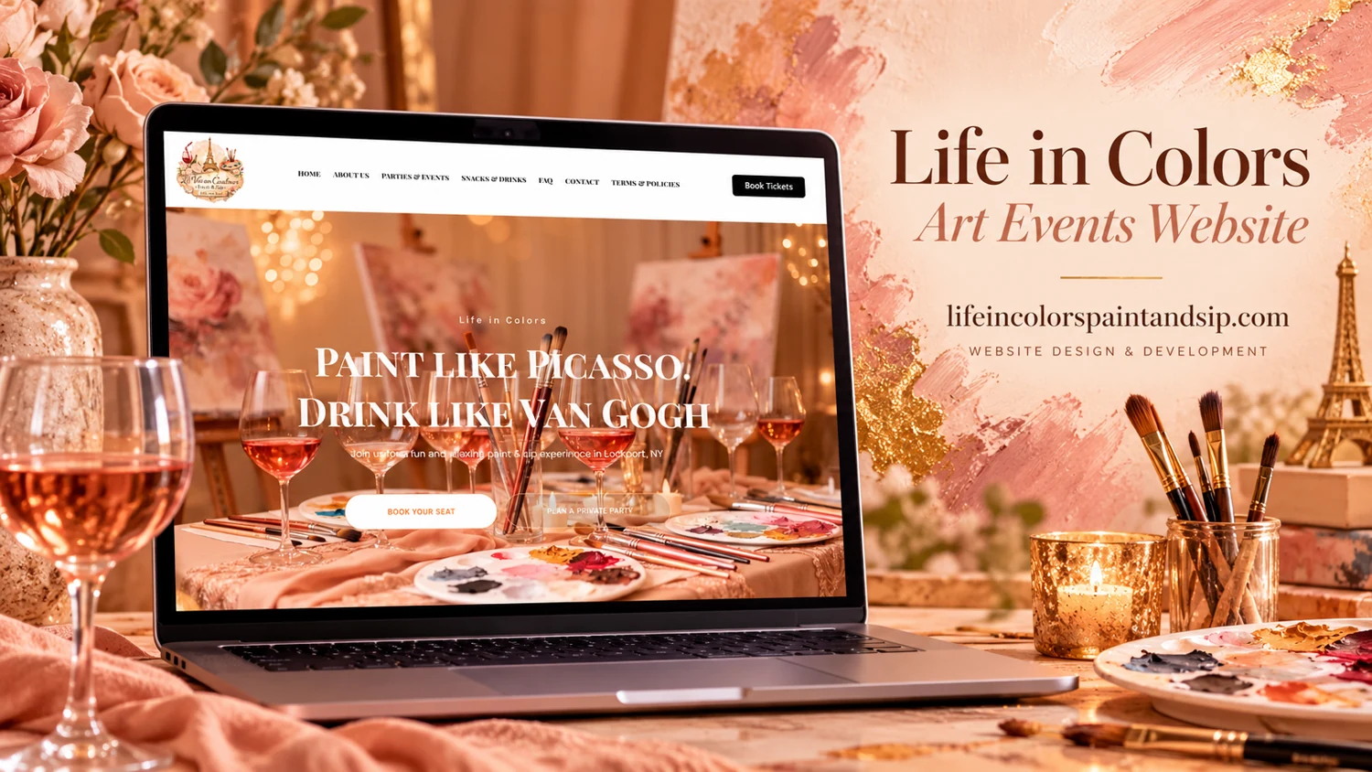
    The provided cover names Life in Colors and identifies an art-events website. The visible laptop screen combines paint-related imagery, a large playful headline, a pale navigation bar, and a dark action button. A live browser attempt timed out, so the current event schedule, booking process, and page destinations could not be verified.

    Visual direction

    Warm peach and pink tones, art materials, and glassware give the composition a relaxed workshop atmosphere. The website shown in the cover lets the experience imagery occupy most of the first screen. This approach can help communicate the social character of an activity before a visitor reads practical details.

    Design rationale

    The essential next layer would be accurate event dates, location, pricing, accessibility information, and what participants receive. Public sessions and private-group enquiries may require different routes. These are design recommendations based on the reference’s visible positioning, not assertions about existing booking features or confirmed business offerings.

    Reference-based analysis: the live page was not fully accessible, so current content and interactions remain unverified.

  • Vanguard Art

    Vanguard Art

    Website analysis and design rationale

    An art-gallery reference presents an editorial, exhibition-oriented homepage with a restrained navigation system.

    Audience and purpose

    An exhibition visitor may want an introduction to the featured work before deciding whether to explore artists or contact the gallery. The reference gives the exhibition title enough visual weight to support that first step. The important balance is between a gallery-like atmosphere and usable information about what is being shown.

    Observed presentation

    The live browser capture returned the Vanguard page title but very little accessible content. The supplied cover provides stronger visual evidence: it identifies an art gallery website and displays a founding-edition exhibition headline in a dark central panel. The visible header is pale and compact, with multiple small navigation items.

    Visual direction

    Brown stone, gallery-like lighting, and sculptural objects frame the supplied website presentation. The central site uses a dark artwork-led composition with a light serif headline. This visual approach connects the page to an exhibition environment and gives the featured title more prominence than competing interface controls.

    Design rationale

    A fuller review should verify exhibition dates, artist information, artwork descriptions, and contact or purchase pathways. Image-led pages need meaningful text alternatives and readable captions. Because the live text capture was incomplete, this analysis does not claim that those supporting pages exist or that gallery interactions function correctly.

    Reference-based analysis: the live page was not fully accessible, so current content and interactions remain unverified.

  • Axium Narrative

    Axium Narrative

    Website analysis and design rationale

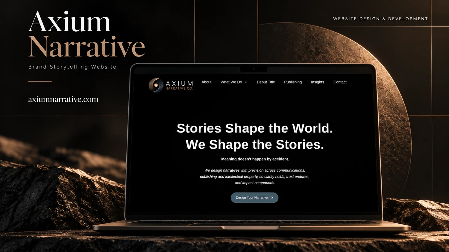
    A narrative consultancy presentation connects communications, publishing, and intellectual property through a focused introductory page.

    Audience and purpose

    A prospective publishing partner and a communications client arrive with different expectations. The existing navigation acknowledges that distinction, but the homepage’s broad narrative proposition leaves the detail to subsequent pages. The design rationale is therefore strongest when viewed as an entry point into a specialist practice, with the concise hero establishing tone and the category pages carrying explanation.

    Observed presentation

    The observed navigation separates About, What We Do, Debut Title, Publishing, Insights, and Contact. Its main statement introduces story development, followed by a short explanation of the company’s positioning and a contact invitation. An embedded video appears before the central message.

    Visual direction

    The supplied cover places a dark website inside an earthy, stone-textured editorial composition. A restrained blue action contrasts with the predominantly black hero. The short headline and concentrated navigation make the initial experience feel closer to a studio introduction than an extensive service catalogue.

    Design rationale

    The useful design question is how to carry this concise introduction into specific service pages. Distinct explanations of communications, publishing, and intellectual-property work would let visitors select a relevant route. Video should supplement accessible written context, while the contact step should make the information required for an initial enquiry clear.

    Analysis based on the captured public homepage and supplied reference; authorship and business results were not established.
  • Tamaway

    Tamaway

    Website analysis

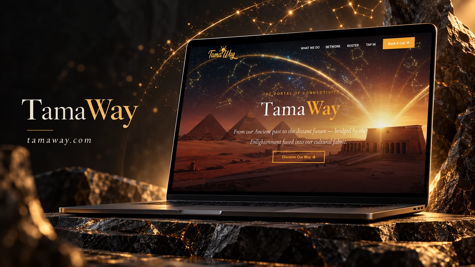
    The public capture includes What We Do, Network, Roster, and Tap In navigation. Its repeated campaign statement emphasizes community and authentic connection. A Book A Call link provides a direct consultation route. These observed elements establish an agency-style introduction but do not establish the scope of any completed campaign.

    Information and visitor journey

    The navigation separates capabilities from the people or network behind them. This is useful for visitors evaluating both an approach and potential collaborators. A repeated statement acts as a thematic cue, while booking offers a more concrete action.

    Design rationale

    Case examples would benefit from separating campaign context, creative approach, and evidenced outputs. Roster entries should explain roles and specialties. The booking destination should be checked because the captured URL includes a trailing parenthesis.

    Presentation and audience

    The refreshed screenshot reveals a strongly atmospheric hero: pyramids and temple architecture sit beneath a star-filled sky crossed by golden arcs. A serif Tama Way wordmark and italic supporting line contrast with the simpler navigation. The visual theme connects the page’s language about ancient culture and future connection, making cultural identity central to the introduction rather than treating it as a small supporting detail.

    Gold is used selectively for the booking button, brand accent, and outlined discovery action. The discovery route sits within the hero narrative, while booking remains in the header for visitors already prepared to speak. This division helps preserve the editorial mood without hiding the business action. Below the hero, the repeated community statement supplies continuity as the visitor moves from imagery into the rest of the site.

    Website analysis based on the observed page or supplied reference; no client brief, authorship, or measured outcomes are asserted.

  • StudioSum Fine Art Studio

    StudioSum Fine Art Studio

    Website analysis

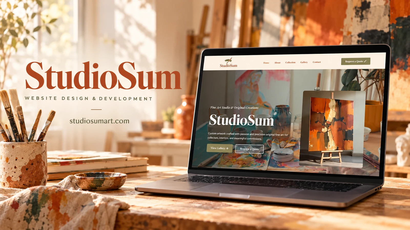
    StudioSum introduces original fine art and custom commissions for collectors and interiors. A cream header uses warm lettering and an olive quote button, while the hero combines a studio-workspace photograph with a framed painting on an easel. Large serif typography gives the artist identity strong emphasis. Navigation separates About, Collection, Gallery, and Contact, and the hero offers gallery exploration or a quote request.

    Design rationale

    The composition establishes materiality through paint, tools, and artwork before asking for an inquiry. Collection and Gallery should have distinct meanings: one might organize available work while the other shows a wider body of practice, but those meanings need explicit labels rather than assumptions. The captured page supports discussion of its visual presentation and commission route without authenticating the authorship of every displayed image.

    The artwork as the primary evidence

    The workspace photograph introduces the physical act of making, while the foreground painting gives the hero a distinct focal object. Cream, olive, and warm brown tones support that material feeling. Large serif lettering gives the studio name presence without turning the first screen into a dense catalogue. The gallery route is prominent, which suits a visitor who needs to see a body of work before starting a conversation. Descriptive captions would make that gallery more informative if they accurately identify medium, size, availability, and the context of each piece.

    A commission inquiry with useful context

    Request a Quote is repeated in the header and hero, making a commercial next step available from the outset. For custom art, an inquiry can be more useful when it distinguishes an existing piece from a proposed commission. A future form might ask for the intended setting, approximate dimensions, and the nature of the request, but those fields are suggestions rather than observed implementation. Collection and Gallery should also be explained so visitors know whether they are browsing available work or an archive. This analysis does not authenticate the displayed works, establish sales, or claim authorship of the website. It describes the visual hierarchy and the relationship between art discovery and an inquiry.

    The gallery’s image-led presentation would benefit from meaningful alternatives and captions, allowing the work to remain understandable when images cannot be seen or loaded.