

← All projectsPROJECT SHOWCASE
Caring Hearts Sanctuary
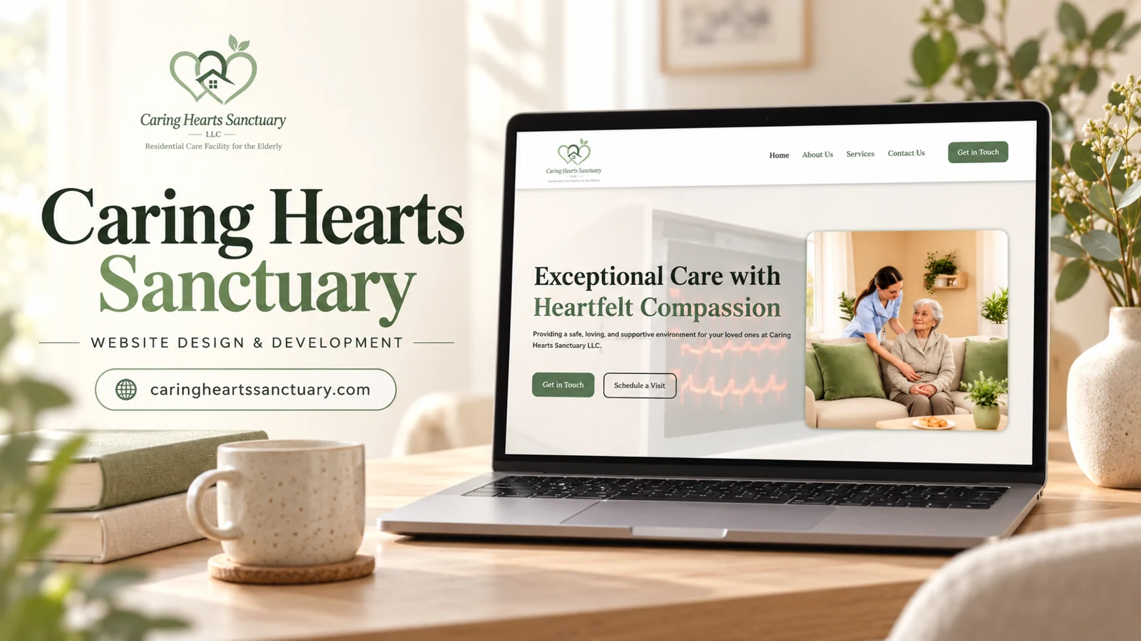
The captured Caring Hearts Sanctuary homepage identifies a residential care facility for older adults through its logo subtitle.
Website analysis
The captured Caring Hearts Sanctuary homepage identifies a residential care facility for older adults through its logo subtitle. The first screen pairs a compassionate-care message with an image of a caregiver and an older woman. Green accents, warm neutral backgrounds, and a clear two-column composition set a calm tone. Navigation includes Home, About Us, Services, and Contact Us, with Get in Touch and Schedule a Visit actions.
Design rationale
The two calls to action support different levels of readiness: an initial question and an in-person visit. That distinction is appropriate for a considered family decision. The screenshot supports analysis of the visible page and its tone; it does not verify care quality, staffing levels, licensing, admission criteria, or available places. Those details require separately approved factual content.
A calm introduction to a considered choice
The first screen uses a warm neutral background rather than a stark clinical treatment. Green accents connect the heading, logo, and primary action, while the caregiver photograph gives the message a human focus. The large serif headline creates a measured, reassuring tone. A faint clinical image in the background adds a care-related context without competing strongly with the foreground. These visual choices can make the page approachable, but the content still needs to answer practical family questions. Atmosphere should support factual information about the facility rather than stand in for it.
Supporting inquiry and a visit
Get in Touch and Schedule a Visit describe different intentions. A family may first want to ask about suitability, while another visitor may be ready to see the setting. Keeping those routes separate can help the eventual conversation start at the right point. The Services and About Us pages offer logical places for verified information about daily support and the organization. A future content review should ensure that photographs are accurately represented and that any credentials or care claims have an approved source. This website analysis is not an assessment of clinical practice, resident experience, or whether the facility is appropriate for a particular person.
The logo subtitle and the hero message work at different levels: one identifies the type of facility, while the other conveys the desired tone. Keeping both readable helps warmth coexist with a concrete description of the setting.
More selected work
Community & Nonprofit
Essential Life Skills
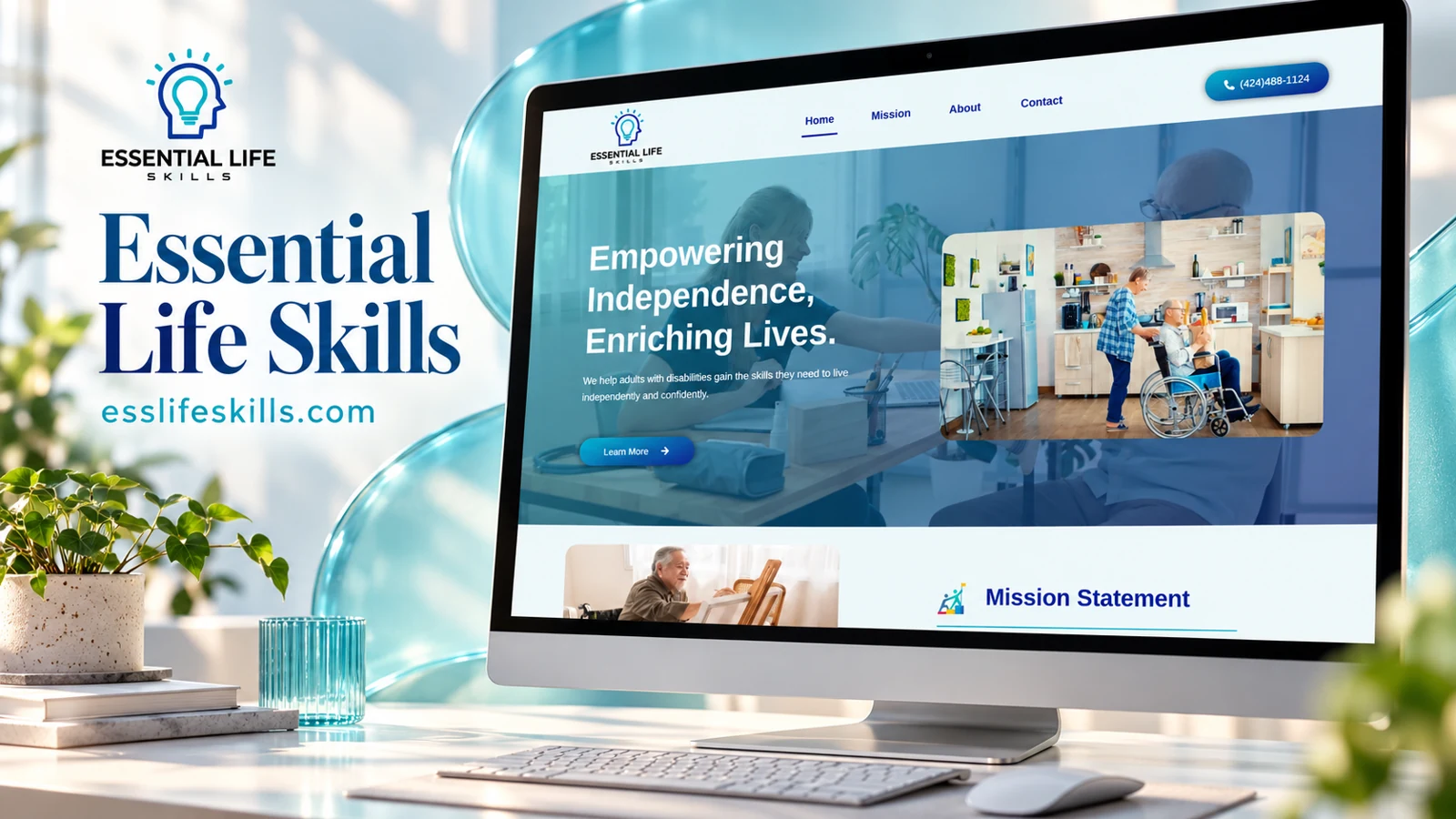
An independent-living services website with clearly stated referral and eligibility information.
Community & Nonprofit
Rise Again Housing
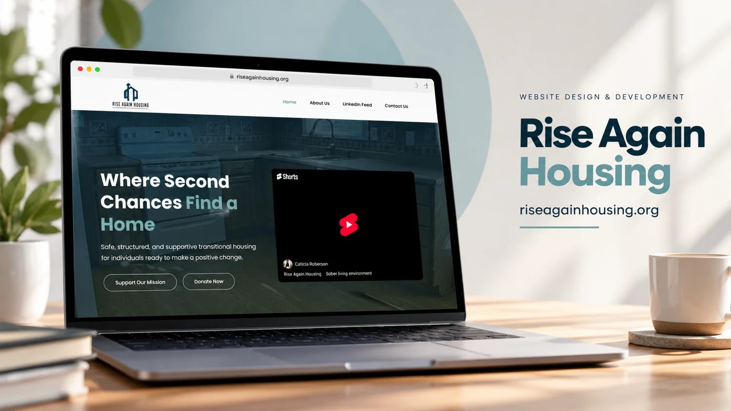
A mission-led transitional housing page connects a clear statement of purpose with donation and contact routes.