
E-commerce & Retail
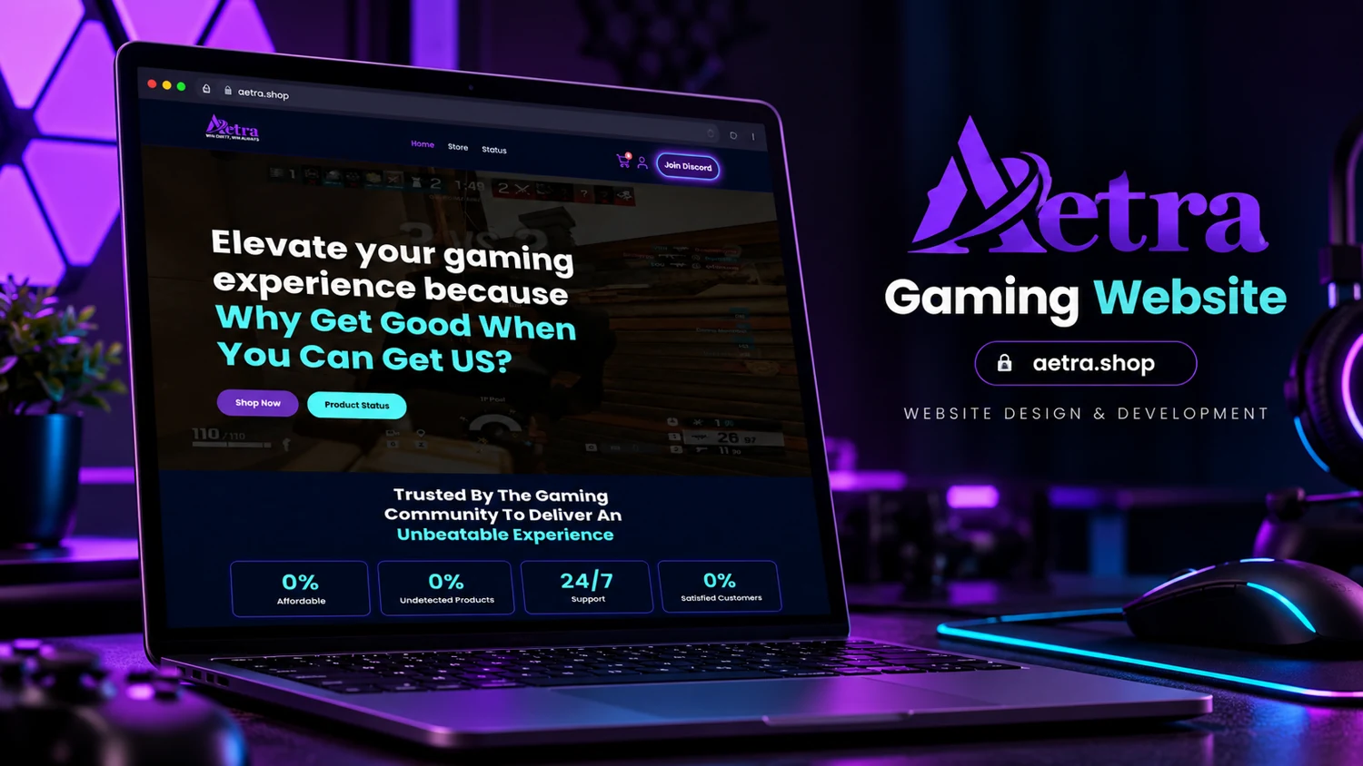
Aetra
A gaming-product storefront with category browsing, status information, and community support.
Level I Is Enough presents a collection-led brand through prominent collection and shopping links.

Level I Is Enough presents a collection-led brand through prominent collection and shopping links. The header contains a product search field, account access, cart access, contact navigation, and an off-canvas menu trigger. The hero uses a short brand statement followed by Explore the Collection and Shop the Look actions. These visible controls establish a retail browsing structure, although checkout completion was not tested.
The site gives brand expression and product discovery distinct roles. A memorable opening statement can attract attention, while search and collection routes support visitors who already know what they want. The off-canvas menu should keep categories easy to understand without concealing essential shopping information. The design analysis concerns the visible storefront structure, not sales volume or conversion performance.
The opening statement establishes an identity before presenting products, while Explore the Collection and Shop the Look invite a move into browsing. Because both recorded actions point to the collection route, their wording creates two expectations around one destination. That may be intentional, but the destination should satisfy both: a broad collection overview and a visually coherent look. Product search serves a different intent again, supporting visitors who arrive with a specific term in mind. The header therefore combines discovery, direct retrieval, account access, and cart access in a compact retail structure.
An off-canvas menu can preserve a clean visual opening, but its categories should remain recognizable and easy to return from. Account and cart icons need clear accessible names, and the cart state should be understandable without relying only on a number. These are design criteria rather than verified defects. The observed contact route gives shoppers a place for questions that product information may not resolve. A fuller review would need actual product and checkout pages before discussing sizing, delivery, payments, or order management. The present analysis is limited to the storefront’s visible organization and the relationship between its brand-led hero and its shopping controls.
The visible empty-cart state establishes a baseline for shopping feedback. A future interaction review should check how that state changes after a deliberate product action, rather than assuming that a displayed cart control proves a working order process.
A gaming-product storefront with category browsing, status information, and community support.
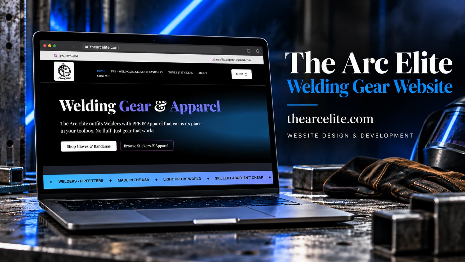
A supplied welding-gear reference combines a dark industrial presentation with a shopping-oriented page structure.