

Home Services & Construction
1General Contractor LLC
1General Contractor presents roofing, remodeling, water restoration, and gutter services.
A Sacramento construction website combining project discovery and estimate requests.
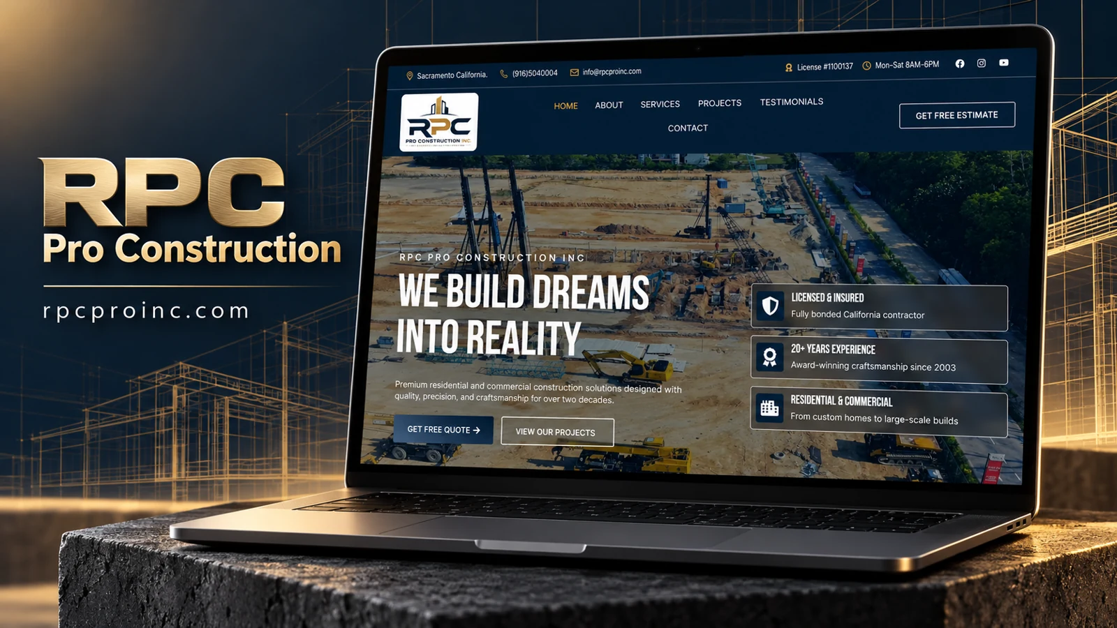
The rendered homepage identifies RPC Pro Construction Inc and displays Sacramento, California, contact information. The navigation includes About, Services, Projects, Testimonials, and Contact, with a separate free-estimate action. The hero introduces residential and commercial construction and pairs a quote route with View Our Projects. This browser evidence replaces the earlier research-tool timeout.
A dark navy header contains the RPC logo, contact information, hours, and a license-number statement. Gold accents appear in the utility row and active navigation. Below, an aerial construction-site photograph fills the hero, with a dark overlay supporting large condensed white lettering. The imagery emphasizes the scale and activity of construction rather than presenting only finished interiors or a single house.
The left side carries the introductory message and two actions. The right side groups three credibility themes into bordered translucent panels: licensing and insurance, experience, and residential-commercial scope. This arrangement lets a reader scan the proposed reasons to consider the company without interrupting the main introduction. These remain statements made by the website; the review does not independently verify the license, insurance, experience, or award references.
A prospective customer can request an estimate directly or first examine projects. These are distinct stages of evaluation, making the paired actions more useful than duplicate contact links. The service and project destinations should connect clearly: a visitor exploring a particular construction need benefits from seeing relevant examples and an accurate account of the company’s responsibility in each. Testimonials provide a further route, but they should be supported by attributable source information.
The dark header and image overlay create continuity across the first screen, while white text keeps the reading hierarchy prominent. The portfolio emphasis is especially appropriate for a visually evaluated service. A useful next review would check whether project pages retain that clarity and whether the estimate destination explains the information needed to begin a conversation. This analysis asserts no development authorship or measured commercial result.
1General Contractor presents roofing, remodeling, water restoration, and gutter services.

Custom kitchen design and cabinet presentation with a project inquiry journey.
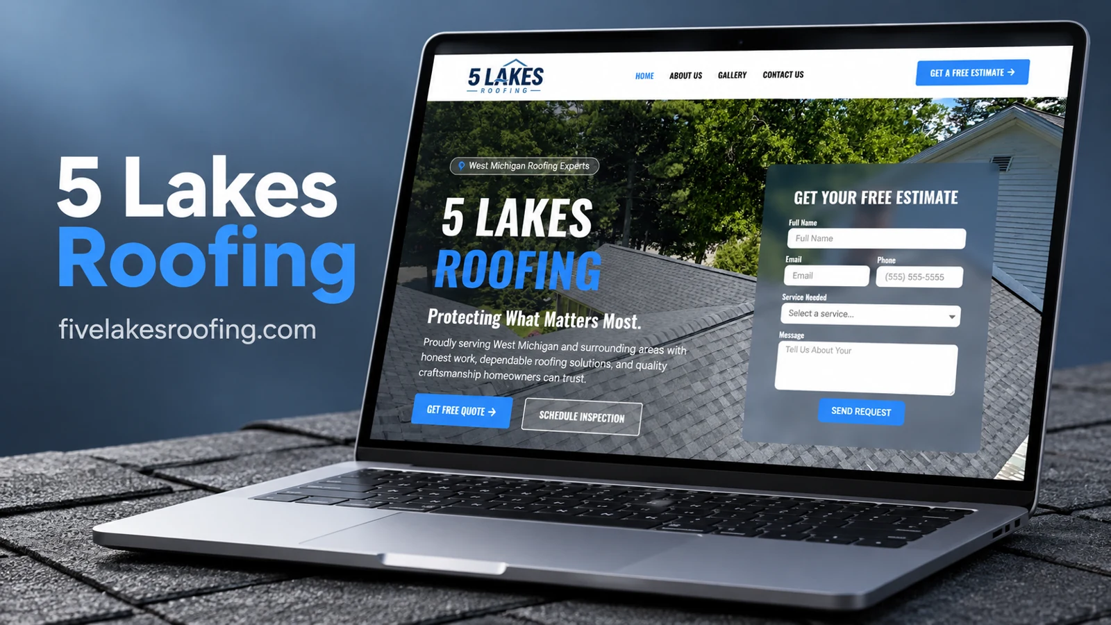
A roofing inquiry interface organized around specific service needs.